


Spring into style at home
Let spring set the stage for a new change.
Spring has arrived and like every year, we find ourselves taking in a welcoming sigh to warmer weather, flowers blooming and the new fresh new energy that blooms in springtime.
Yet when we look around our home, we can feel the lingering remnants of a long cold winter which are not exactly flowing with our new inspiring breaths of spring.
Historically and religiously, spring has been attributed to a period of transformation, renewal, and new beginnings. As the buds start to pop with fresh and bright colours, so does the symbolism of starting fresh and starting over.
This is the ideal time to take stock not only of our inner environment but also our outer environments starting with our home. Hence the idea of spring cleaning pops into our mind and rightfully so…it’s time to move things out to make room for life’s joys to move in.
Here are a few ideas to help you welcome in the spring with style in your home for a fresh start!
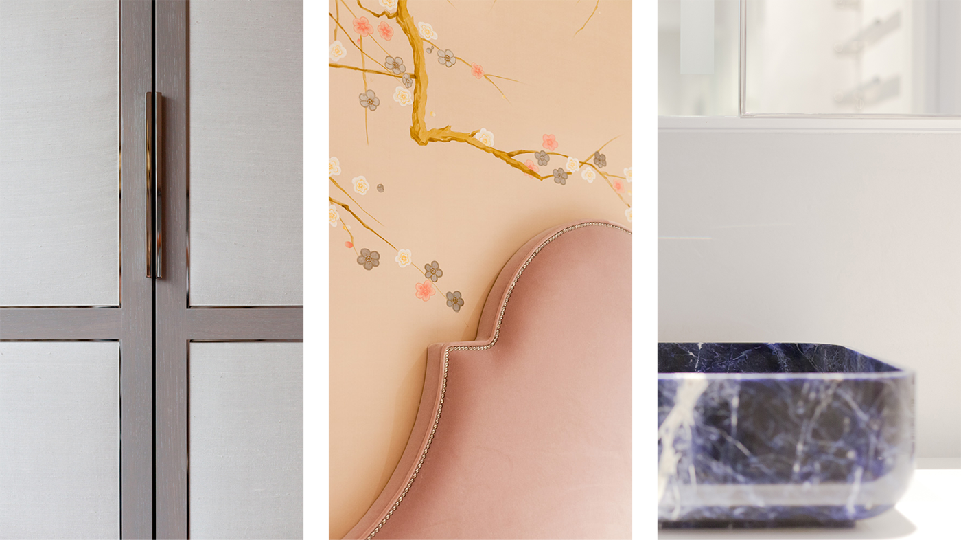
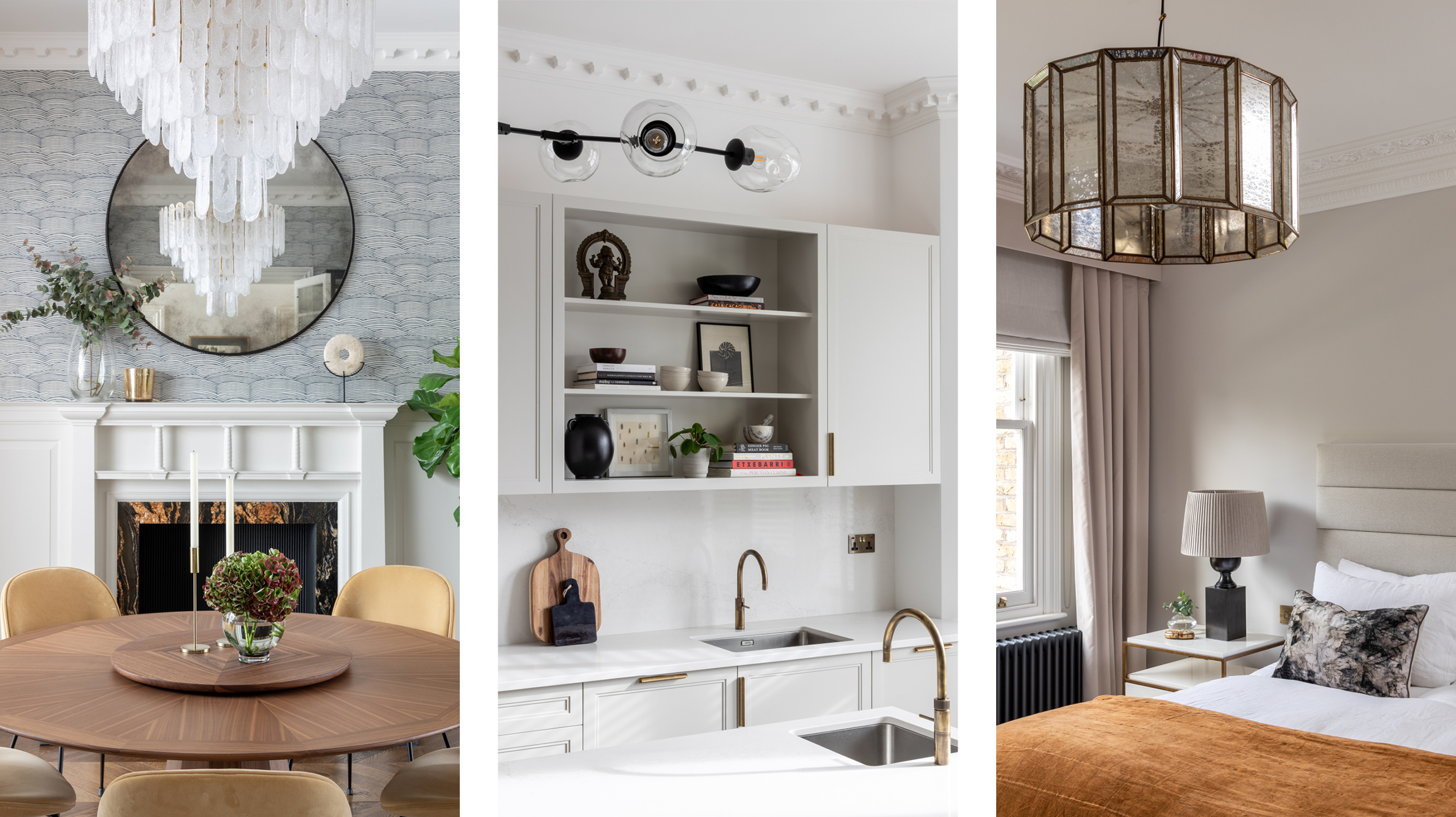
Start with decluttering
If decluttering seems to be a daunting task, consider it this way. You are clearing out the chaos.
Lack of storage, the colours in your home that were once bright and are now drab, all the extra stuff that your spouse has filled up the house with, all the things that your kids have trouble with keeping tidy, and the same furnishings you have kept for the last 10 years, as well as your overstuffed closets with items that you haven’t worn in years. These are all things that create a stuck feeling in your home and in your head.
If you are looking to sell or rent your home, this is the first order of business your agent will tell you.
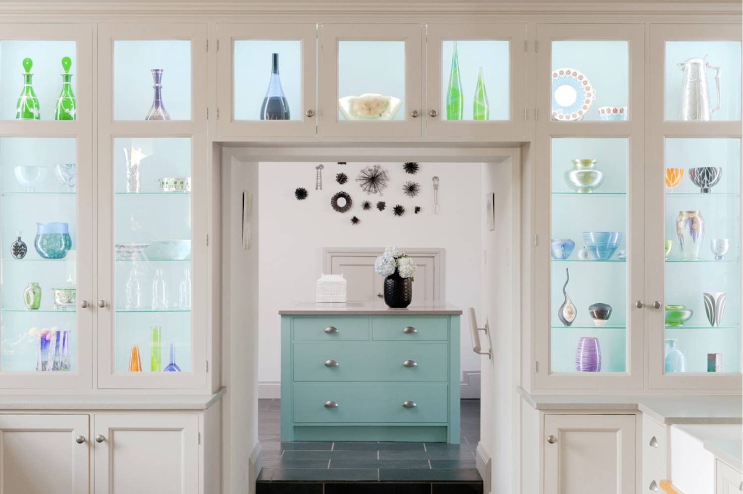
The dramatic difference wall colour makes
One of the fastest ways to bring new energy into your home is through colour. Look at the colours on your walls. Are the walls dirty or faded? Remove a piece of furniture from the wall and you will see if it is.
Colour directly affects our moods. They can affect our emotions and state of mind. They can also directly affect the amount of natural light you have in your home by how much light the colours absorb and reflect the light.

Callender Howorth residential High Gate house project.
Callender Howorth estate project in Twickenham, UK.
Before you pick a paint colour, Benjamin Moore has a wonderful app have an app where you can photograph your room and drag your paint colours onto the wall and it populates the colours for you. It’s brilliant and a really clever way to see the difference a new wall colour will have in your space.
Upgrade your walls with new wallpaper and wall coverings.
If you are inspired to upgrade your walls to another level, then it’s worth taking a look at all the beautiful collections of wallpaper available now. Gone are the days of the outdated wallpaper from the 1970s and 80s!
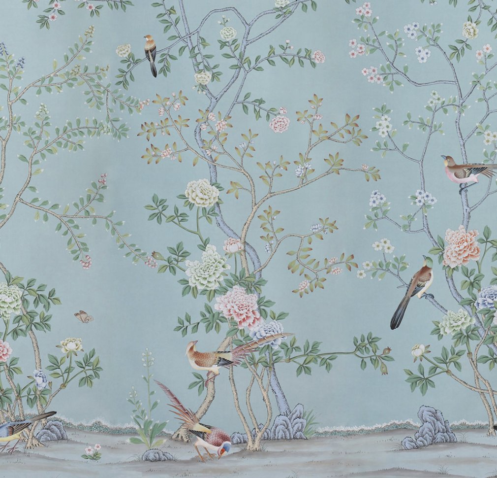
deGournay’s Chinioiserie Collection Earlham Standard Colourway.
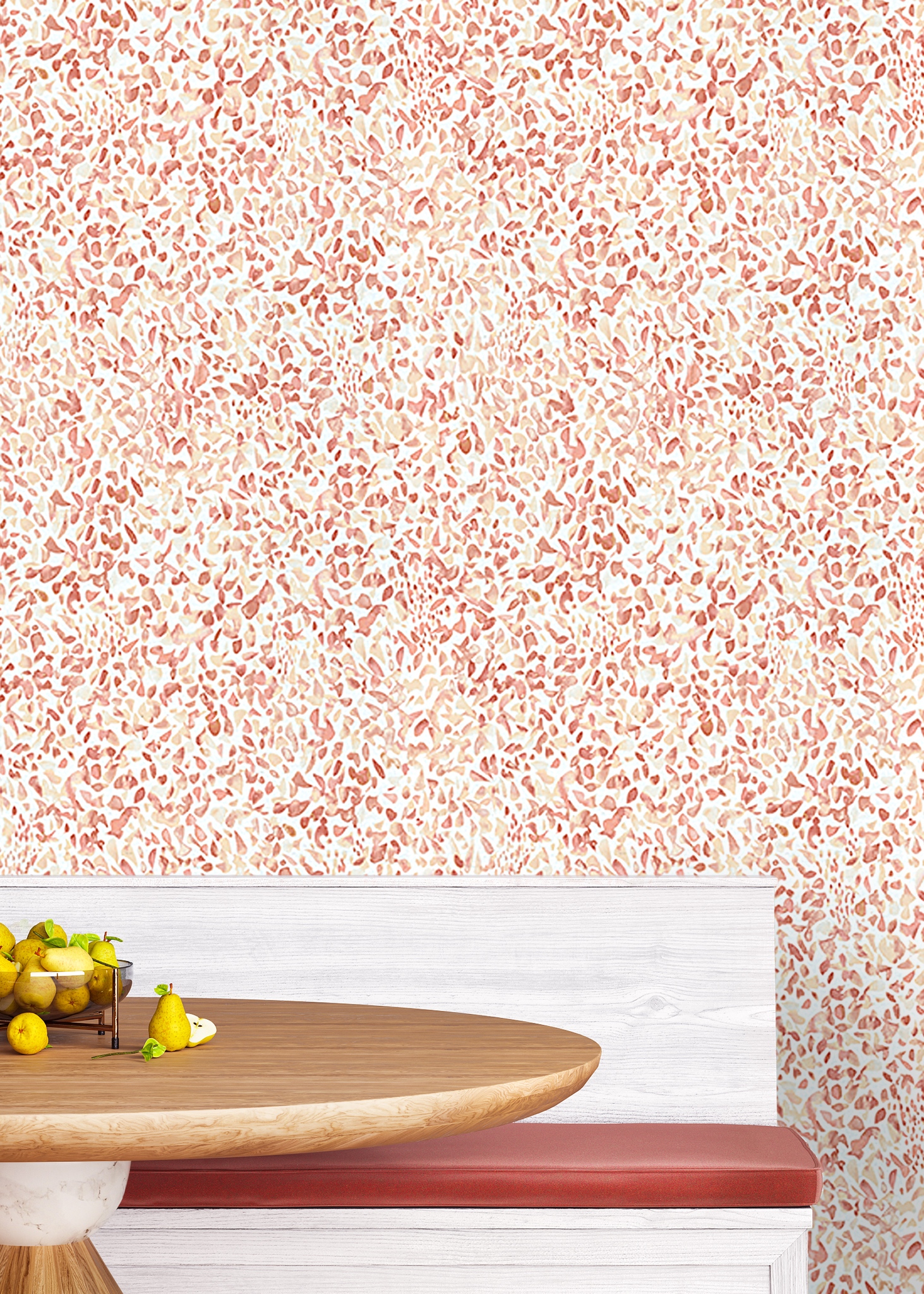
Pretty Petals by Phillip Jeffries.
Callender Howorth residential Country House project.
Some of the hand-painted designs and print designs are exceptional as well as innovative with many new textures, selection of materials, natural and even recycled wall coverings to choose from.
Philip Jeffries Manilla Hemp are handcrafted and use only sustainable materials.
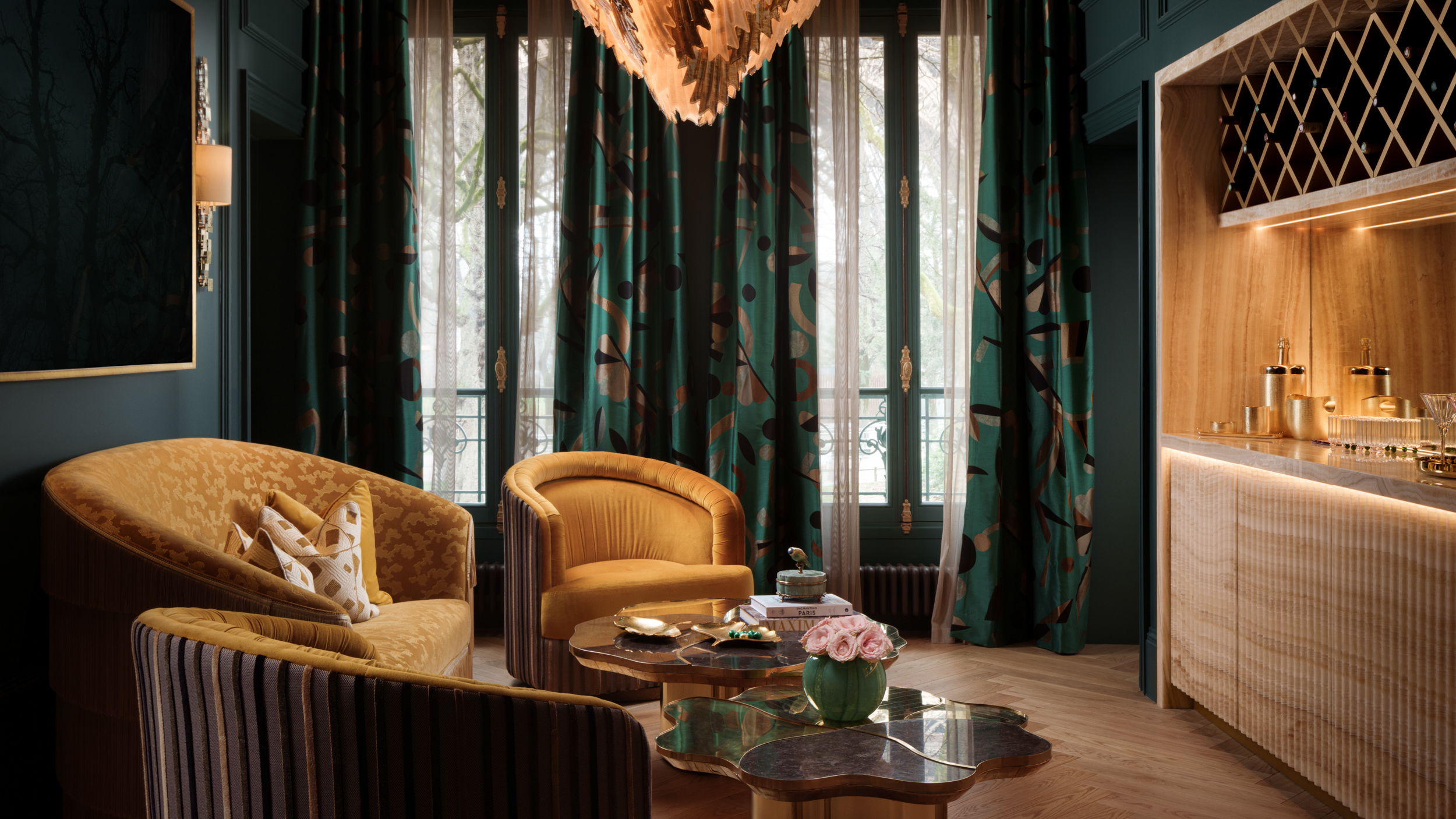
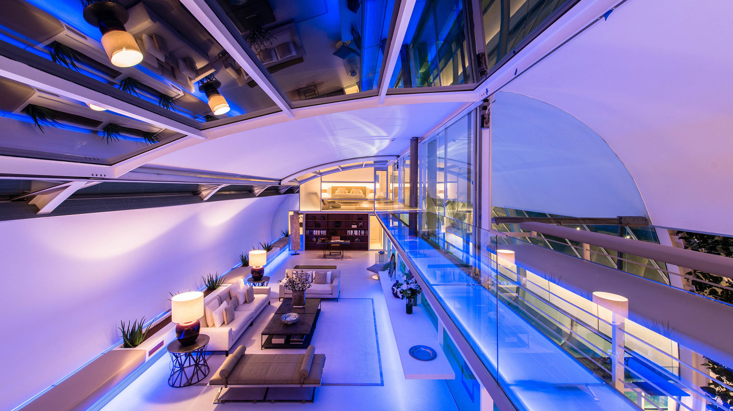
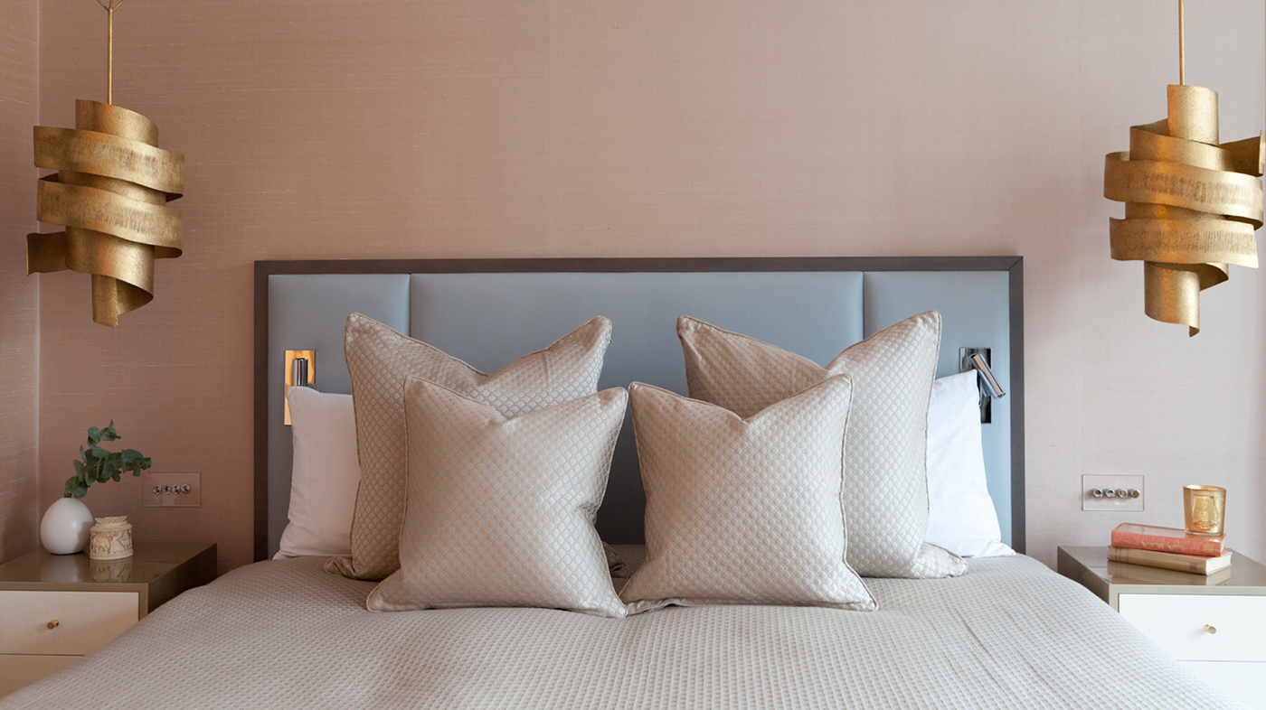
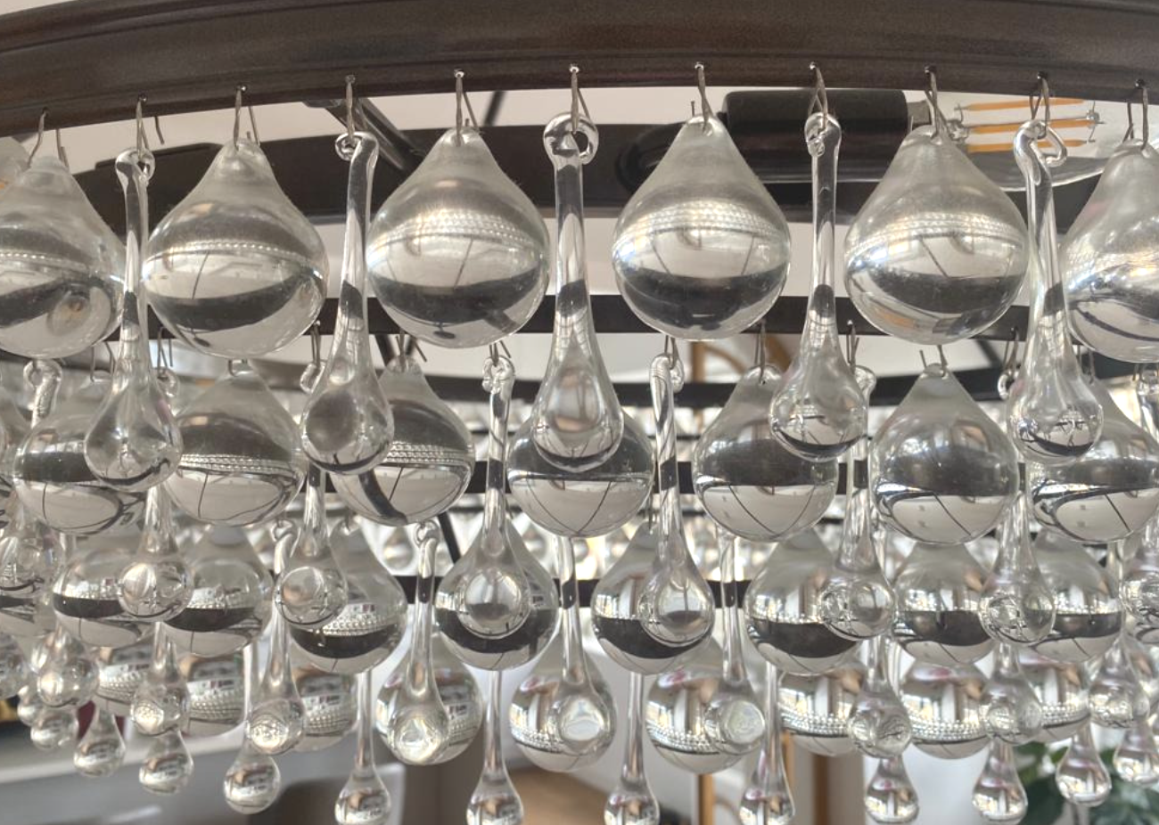
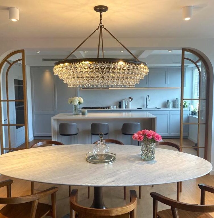
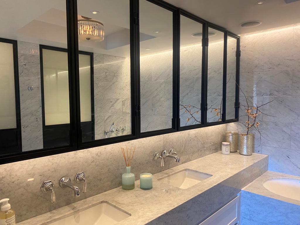
Lighting, lighting, lighting
One of the pillars of interior design is the lighting.
Capturing the natural light, mood lighting, direct and indirect lighting, all play an integral role of the mood, look and feel of your home.
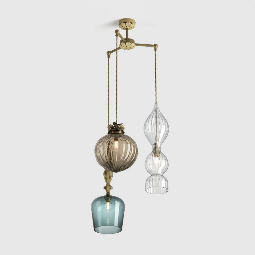

In our Aspen House project the Callender Howorth team worked with Rothschild & Bikers to create a custom pendant chandelier.
Pendants and chandeliers naturally draw your eye in their luminosity, brilliance and style. They can instantly elevate a room to a luxurious space taking it from simple to sassy!
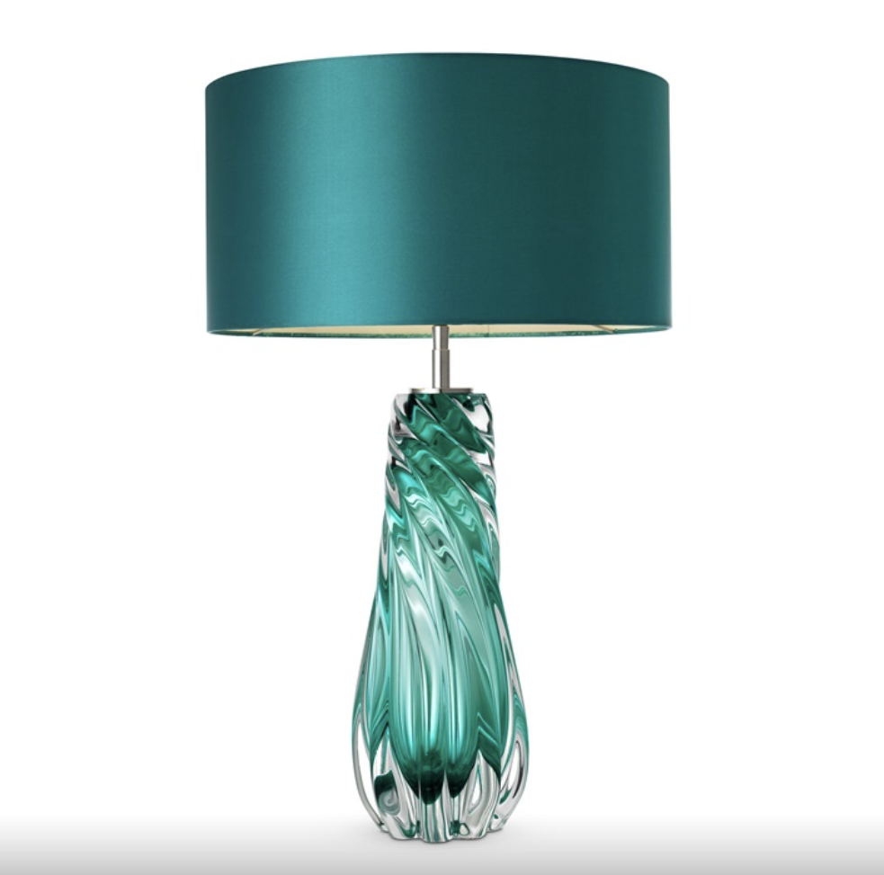
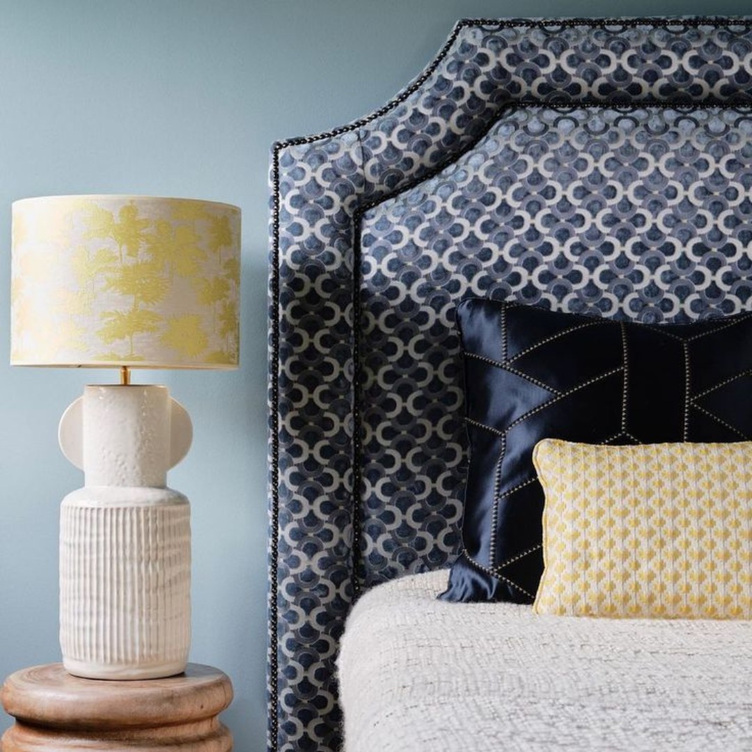
Decorative table lamps are wonderful ways to add lighting as well as splashes of colours to the room.
Barron table lamp by Eichholtz.
We spend a lot of time for our clients getting the lighting just right because it is the thread that ties everything together.
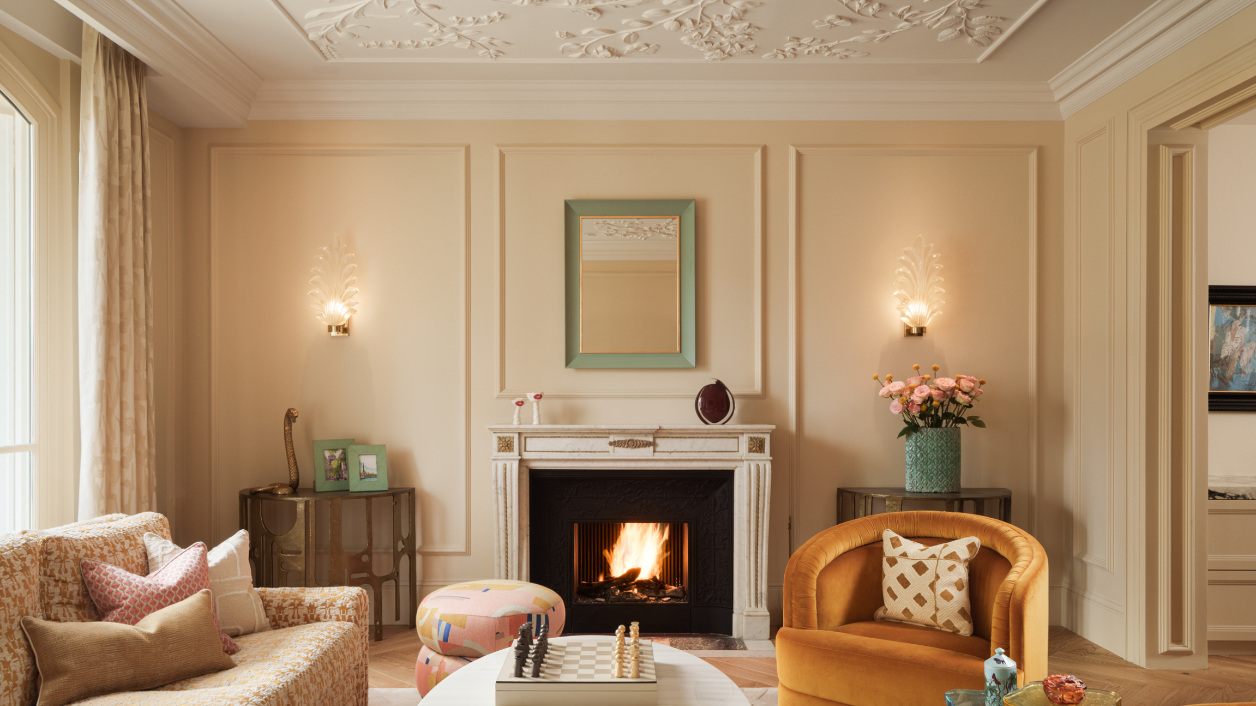
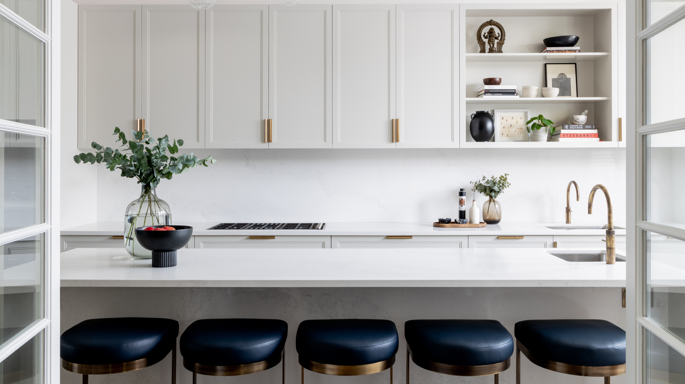
Customise and revitalise
A great way to renew one of your favourite armchairs, benches, headboards, dining chairs or sofas is by customising your furniture pieces. Whether it’s a new piece or a vintage piece, you can create a style that is unique to you.
Fabrics by Dedar Milano.
Pierre Frey fabrics.
There are so many fabulous fabrics to choose from and you can play with textures and colours to create the perfect accent piece or focal point in your space.
A couple of our favourites are Italian Dedar Milano and French fabric supplier Pierre Frey whose fabrics and textiles can turn any furniture piece into a stunning showstopper. By customising your furniture, your signature personality comes through in the ambiance in the room.
Total transformation….a complete fresh start
If you are looking a complete fresh start, we recommend a total home transformation. It’s more than just interior design. It’s a life change.
We spend a considerable about of time getting to know our clients even their children so that the new design truly reflects their needs, lifestyle and desires. Your home should reflect your personality and the way you enjoy living.
After we complete a thorough assessment as well as budget expectations, we sit down with initial concept designs so that our clients can review every aspect of their new home.
If you are looking for a complete change, our team of interior designers and architects are delighted to sit down with you to start the transformation process.
You can email us at info@callenderhoworth.com
New Year New Home with guest Philip Weiser Carlton Group – My Place Riviera Podcast Ep2
On today’s podcast, we are delighted to be joined by one of the Riviera’s iconic real estate legends Philip Weiser, foudner and CEO of Carlton International Property Consultants who has been selling property here for the last 25 years.

Philip, originally from New Zealand, is a long-time resident of 42 years here on the Cote d’Azur, speaks 4 languages, and is one of our favourite storytellers!
We have the pleasure to work with Phillip and his team at Carlton International on interior design and renovation projects as well as finding properties for our clients.
Listen to Episode 2 here:
Among a stunning portfolio of properties for sale, this waterfront home offered by Carlton International is the former home of Annie Lennox and Dave Stewart of the Eurythmics and is certainly an idyllic location to be inspired by the beauty of the Cote d’Azur!
If you have any questions about the topics discussed in this episode of My Place Riviera, we will be delighted to answer them in our next episode. You can send all your questions to info@callenderhoworth.com.
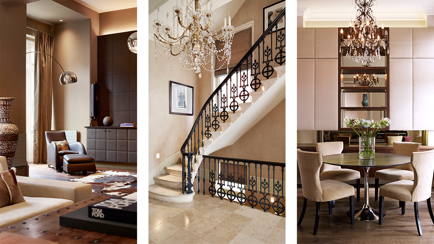
The Wow Factor in Luxury Interior Design
Image above: Primrose Hill penthouse by Callender Howorth.
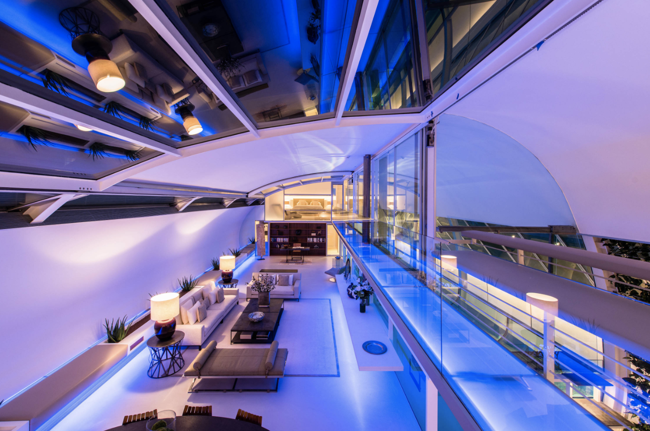
When you walk into a room and feel taken aback by its beauty and sense of wellbeing, what you are responding to is the mood set by the lighting design.
You can have a room filled with beautiful and luxurious furniture and decor, but if the lighting design is not correct, you will not feel the intended energy and experience of the space. In fact, you will feel like something is off, or that it is missing the wow factor.
Regents Park House project by Callender Howorth.
As one of the pillars of interior design, lighting directly affects our senses and our mood. Studies have found that the more intense the light, the more intense emotions are perceived to be. Not only does lighting affect our moods, but directly affects our biorhythm and even our circadian rhythms.
Lighting is what makes us feel safe and relaxed at home, and directly affects our productivity at work. It also links the connection between rooms ensuring a smooth transition from one room to the next.
Heath Drive Hampstead project by Callender Howorth.
Callender Howorth managing director Mark Howorth explains, “Lighting design is such an important element of the interior design process. It is one of the key ways that we create the wow factor with our designs. There are many facets to getting the perfect interior design – and our lighting design team is key to getting the big wow factor that our clients want.
Good lighting design adds the magic that lifts and enhances all of our designs to the next dimension. Whether we are looking to create a cosy reading corner or a multi-function space the same principles are adopted to ensure our projects are delivered to the highest level.”
However, lighting design is a uniquely creative and technical process that requires the vision of a skilled team that can translate the overall design to produce subtle colours and intensity bringing the design to life.
Photo by London Lightworks.
Our team at London Lightworks are masters of creating the perfect balance for our luxury residential projects which require the utmost highest attention to precision and detail.
Photo by London Lightworks.
Mark Kazer from London Lightworks shares his intentions behind lighting design. “An expertly designed lighting scheme adds another dimension to your space, bringing an interior design project to life. Great lighting creates depth and height, and cosy spots, and draws attention to your most impressive areas or features of the room.
It’s all about the balance of light and shade and bringing new energy to an interior. Considering a user’s interaction with any given space is so important to how a lighting scene is set to ensure it is comfortable and really portrays the moods we wish to create.”
Country House residential project by Callender Howorth.
Callender Howorth Interior and Architectural Design provides an English-speaking design and build team for luxury interior design projects across the French Riviera, Monaco, London and New York.
If you are looking to renovate your home, we invite you to contact us by email to Mark Howorth at mark@callenderhoworth.com or call +33 483 5805 27.
For press inquiries contact Juanita Viale at juanita@callenderhoworth.com
Cultural Influences on Design
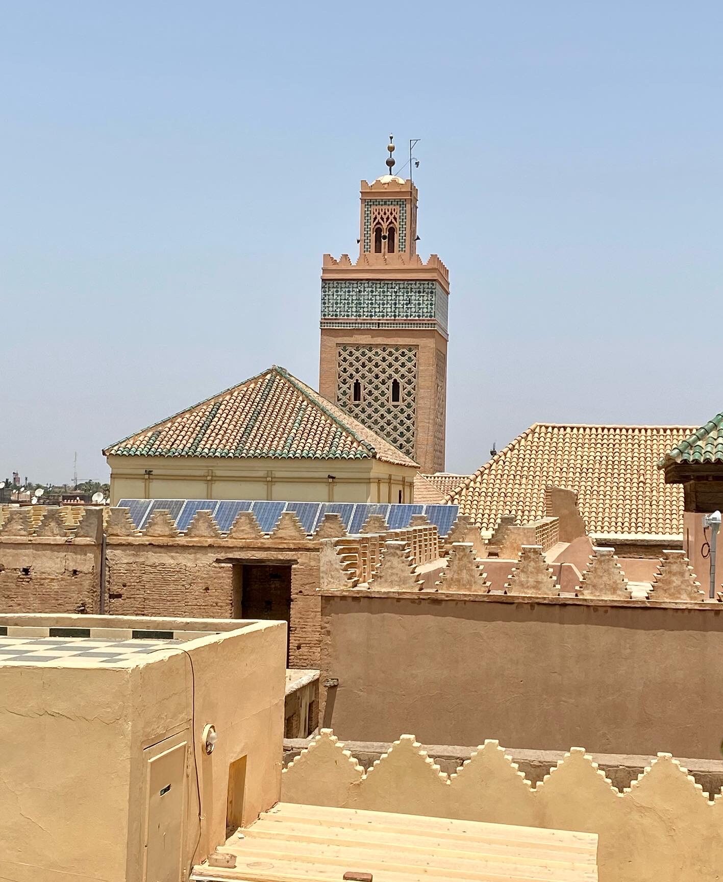
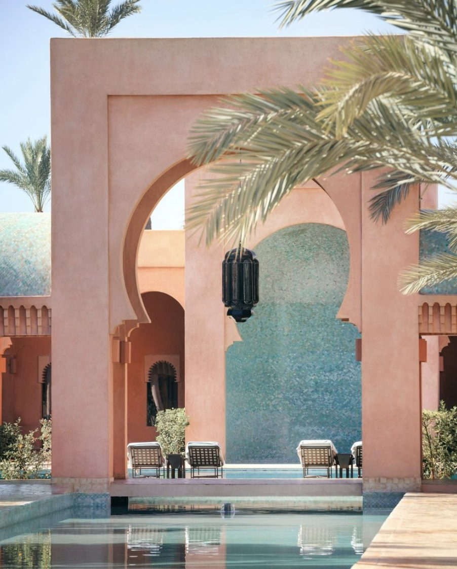
On a recent sourcing trip to Marrakesh, the beauty of the Moroccan culture vividly speaks to you as you meander through the winding ancient streets of the Medina.
The sun-baked red terracotta facades of the buildings and mosques instantly transport you to their ancient roots and history with the energy of its Berber origins permeating this maze-like imperial city.
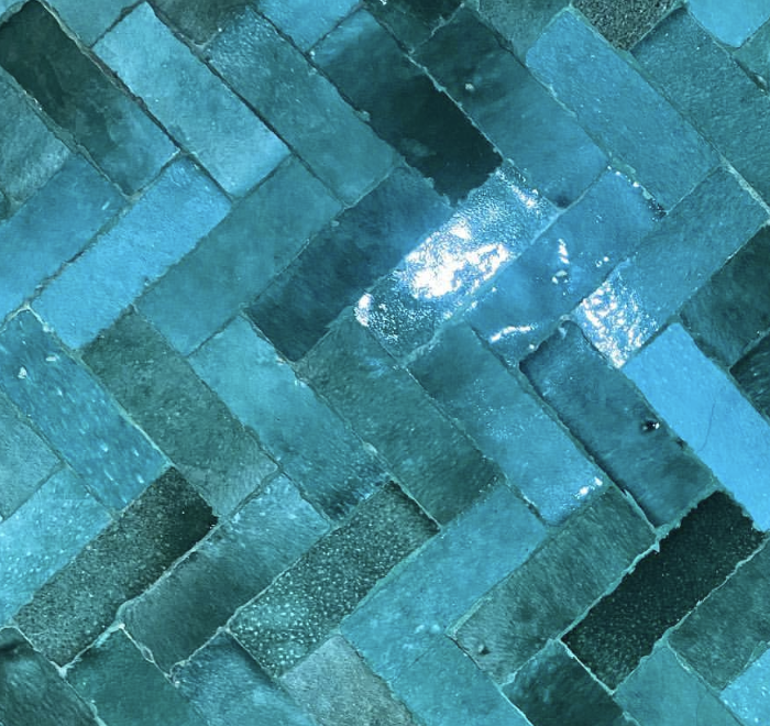
The vivid contrasts in colour you find in the souk are a feast for the eyes with all the hanging handwoven textiles and rugs, baskets, hand-painted tiles, and pottery, flowing tunics and kaftans, and especially the mesmerizing display of spices, so rich in colour and scent infusing all your senses.

Such a dramatic experience reminds us of how the influence of a culture’s subtle and, not-so-subtle energies shape the context of our lives and become a part of who we are.
These cultural mores are so powerful that they are able to carry over into modernity through architecture and design. This collaboration between the traditional and present-day naturally reveals an evolution without releasing its anchor to its soul.
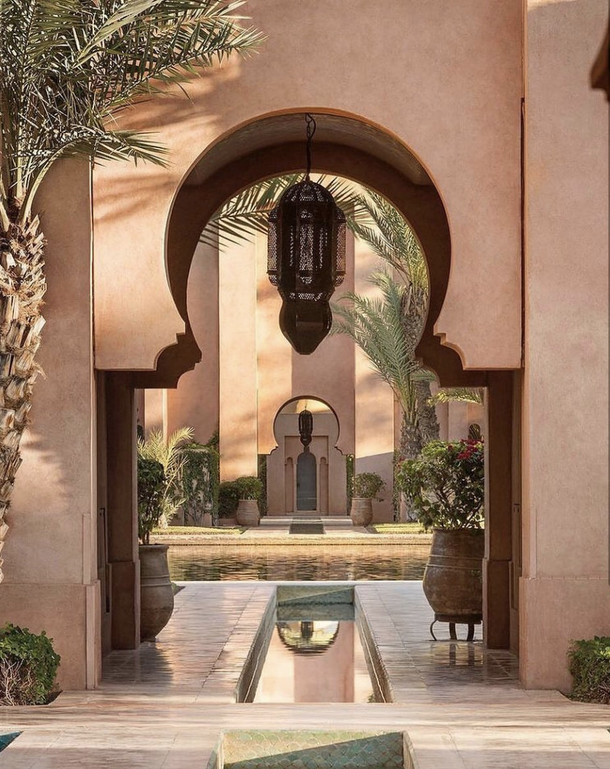
Amanjena Resort
This ennobling relationship can be seen in the medieval medina and the nouveau Marrakesh where you can have 5-star hotels that are redefining luxury experiences such as the Royal Mansour, La Mamounia, and La Sultana.
It is perhaps the reason why we find places like this so compelling because you can tangibly feel and experience the spirit of its origins.
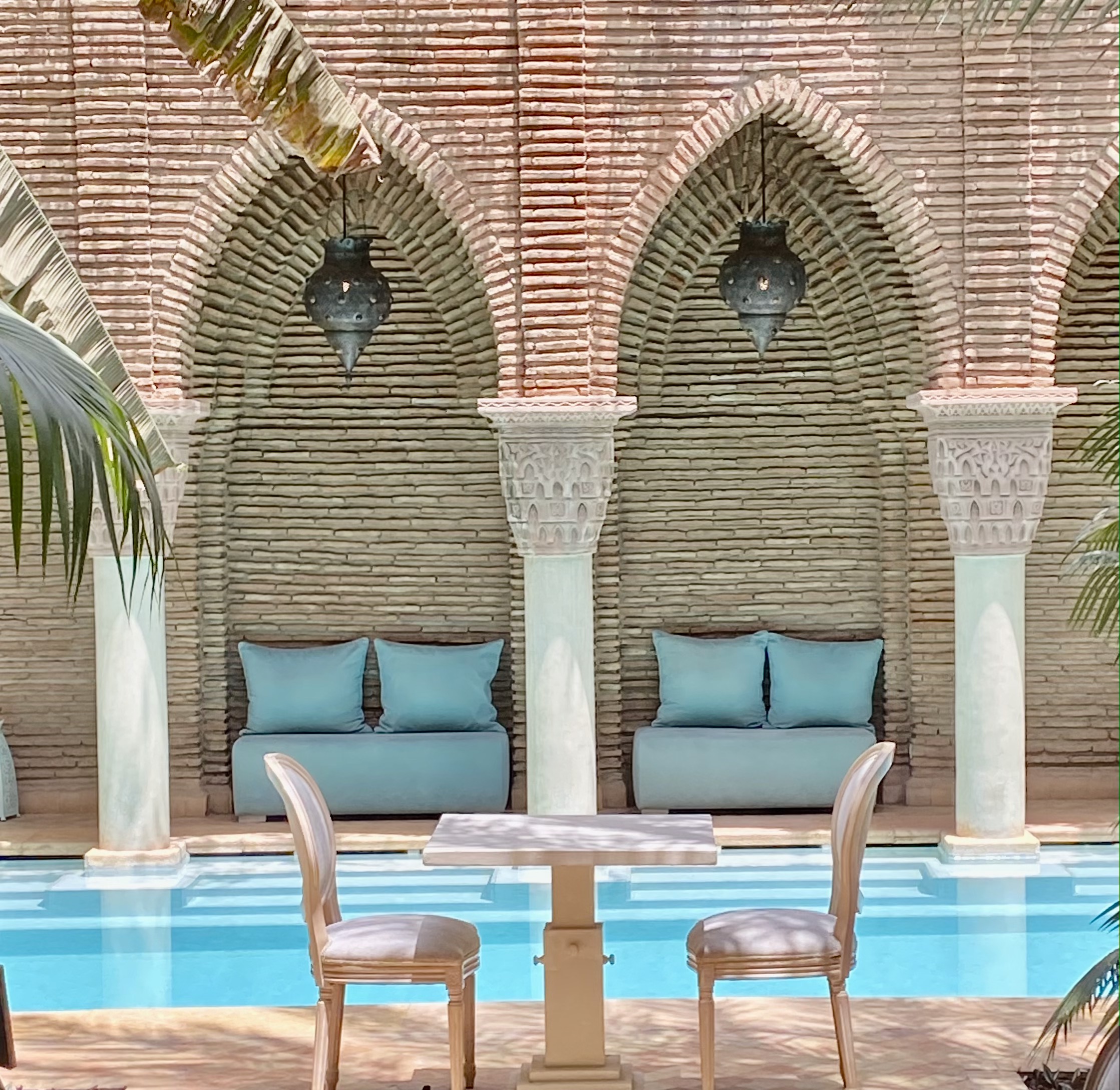
La Sultana Marrakesh. Photo by J.Viale
Amanjena Resort
The unique qualities of these cultural shapes and symbols have become more globalized as interior trends have embraced the beauty and style of cultural tendencies. As our lives have become connected through social media, cultural designs have become very accessible and as a result, they expand the texture of our lifestyle.
Coco Morocco
Yves Saint Laurent is a shining example of a designer whose love affair with Marrakesh, which began in 1996, inspired his fashion designs and where his dedicated contemporary Museum serves as a repository of his Moroccan-inspired designs.
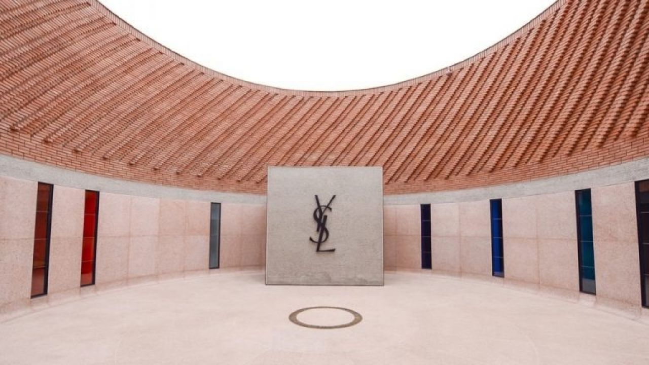
Museum Yves Saint Laurent in Marrakesh
As one of the most contemporary buildings in Marrakesh designed by Studio KO and Yves Saint Laurent’s partner Pierre Bergé, it is no surprise that it also carries cultural symbolism through its walled architecture similar to that of the medina with its patterned red bricks, and contrasted with smooth marble and stone interior similar to the lining of a jacket.

Hamimi Design
The evolution of interior design continues to flourish and we embrace these cultural sensitivities so that the line to the origins of our heritage can continue to be honoured. The unique aspects of our personalities are what gives us our individuality but also what ties us together collectively.
Callender Howorth project Heath Drive was culturally inspired by our client’s Indian heritage.
A Cultural Perspective
As we move toward a more conscious economy, understanding the essence of different cultures and celebrating their beauty evolves our own wisdom and produces authentic designs that preserve the lines of our origins.
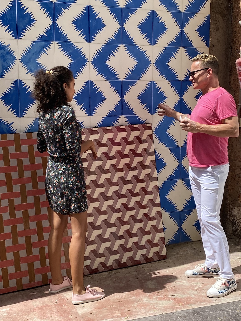
Sourcing tiles for a new project by Callender Howorth.
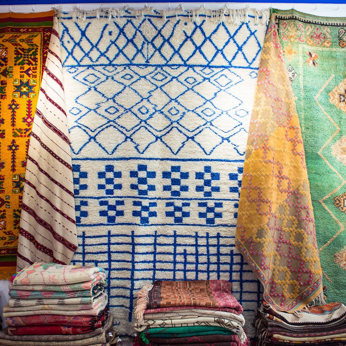
The selection of Moroccan rugs in Marrakesh are endless.
Callender Howorth is always looking for new ideas, inspiration and suppliers for our clients.
We are delighted to be developing some very interesting connections in Marrakesh for new suppliers for tile, rugs, metal work, lighting and of cultural authenticity for our clients who are seeking to infuse their appreciation for cultural influences in the interior design of their homes.
Cover image: moroccan.minimalism
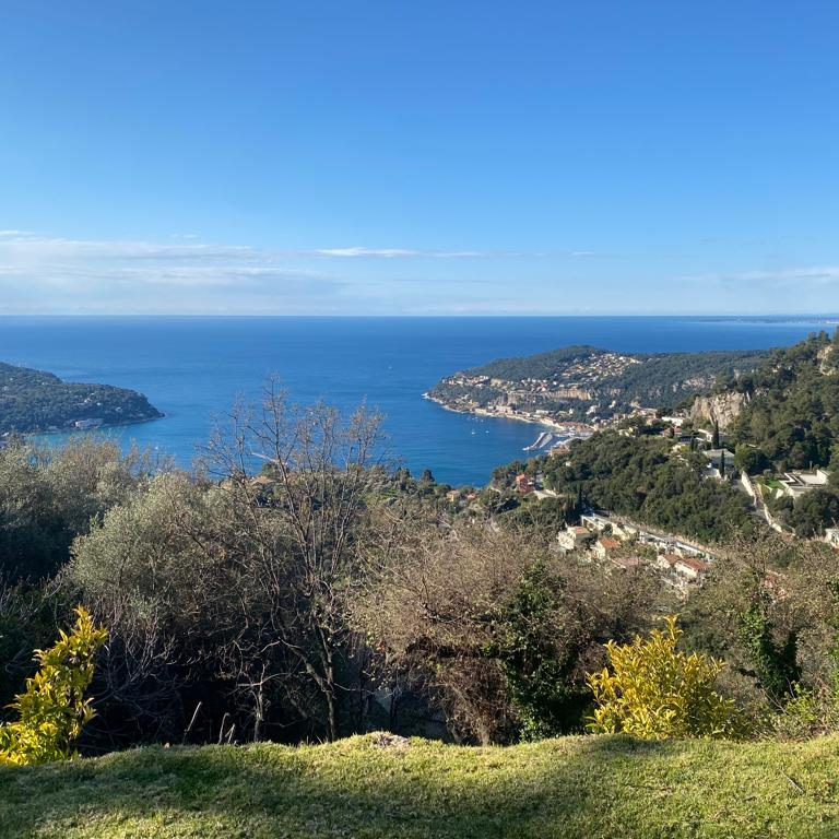
French Riviera Style
The French Riviera is aglow as the Cannes Film Festival and the Monaco Grand Prix have just ended with some of the world’s most recognised celebrities donning the latest designer styles and fashion.
Style is the order of the day.
Actually, every day on the French Riviera is all about style! All the cafes, beach clubs, restaurants, and chic lounges are dressed to impress including the people.
But just what is Riviera style?
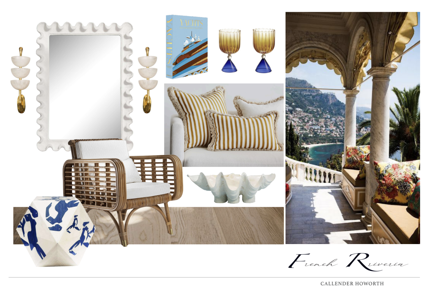
Effortless, Simple Sophistication
With the azure turquoise colour of the Mediterranean in the backdrop, charming sun-bleached frescos of the Maisons de Ville that line most of the ports and villages along the Cote d’Azur, the melange of the Provencal charm with world-class glamour and affluence infuses the subtle Mediterranean breeze.
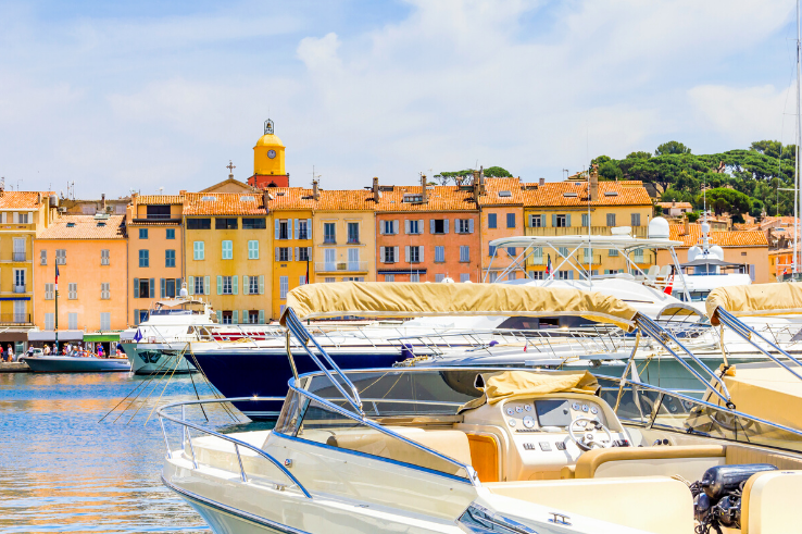
Classic scenes such as Bridget Bardot driving the speedboat in the bay of Saint Tropez in the 1955 film “And God Created Woman” showcased a sublime French lifestyle to the world and elevated the simple fishing village of Saint Tropez as a top VIP destination. The Bardot effect, certainly.
White and Bleu
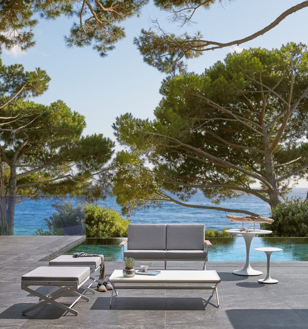
Outdoor lounge by SIFAS Outdoor Design.
From refined and minimalistic light sand and grey tones paired with white linen to nautical blue and white striped parasols and vintage Parisian Epoque in classic black and white woven bistro chairs, White is the Riviera’s signature colour when it comes to style for both decor and fashion.
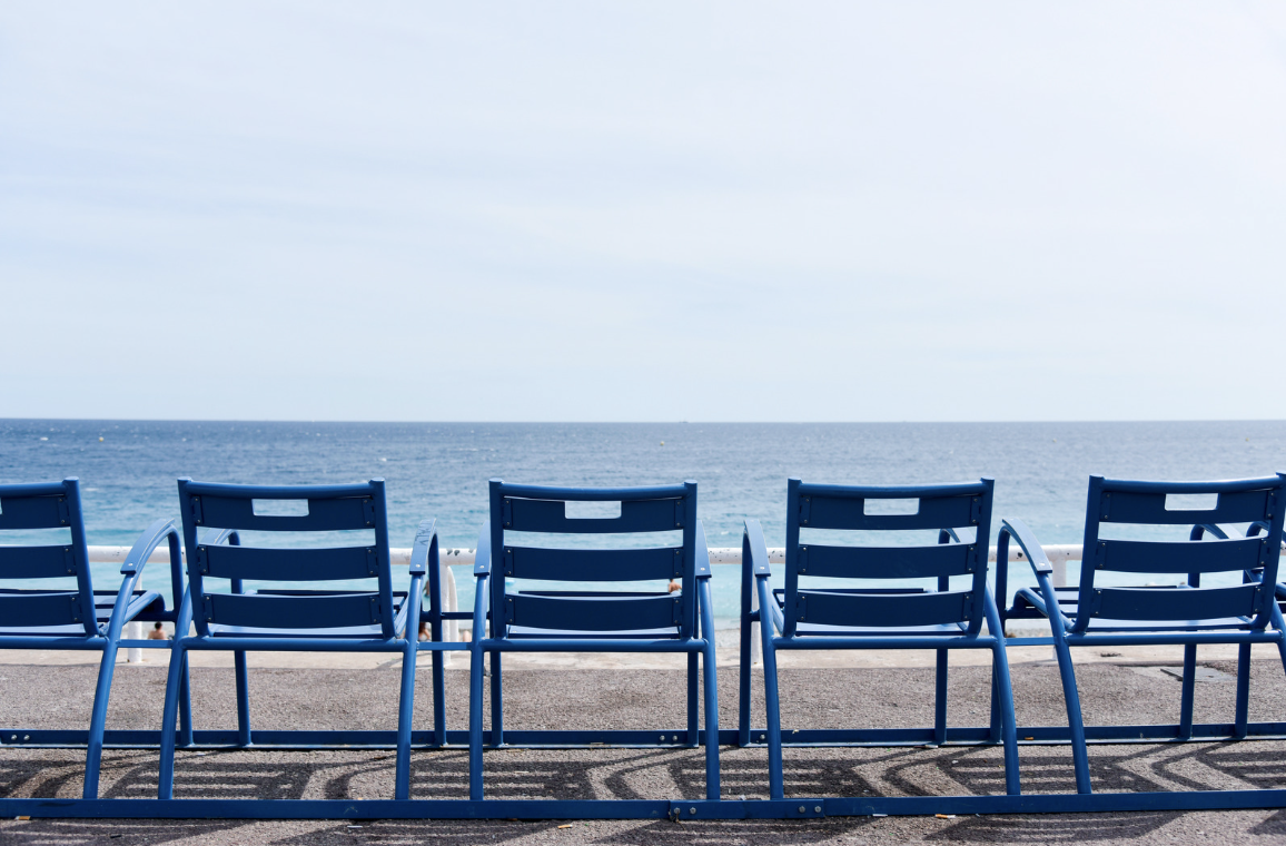
The Chaises Bleu ( The blue chairs) are the iconic signature of the Promenade des Anglais in Nice.
The shades of azure blue is the precious inspiration of the Mediterranean sea.
From the signature chaise bleu of the Promenade des Anglais and on the Croisette in Cannes, you will find an ode to this pristine blue everywhere along the Cote d’Azur.
The essence of this colour palette is where we draw our inspiration from for our interior design projects on the Cote d’Azur.
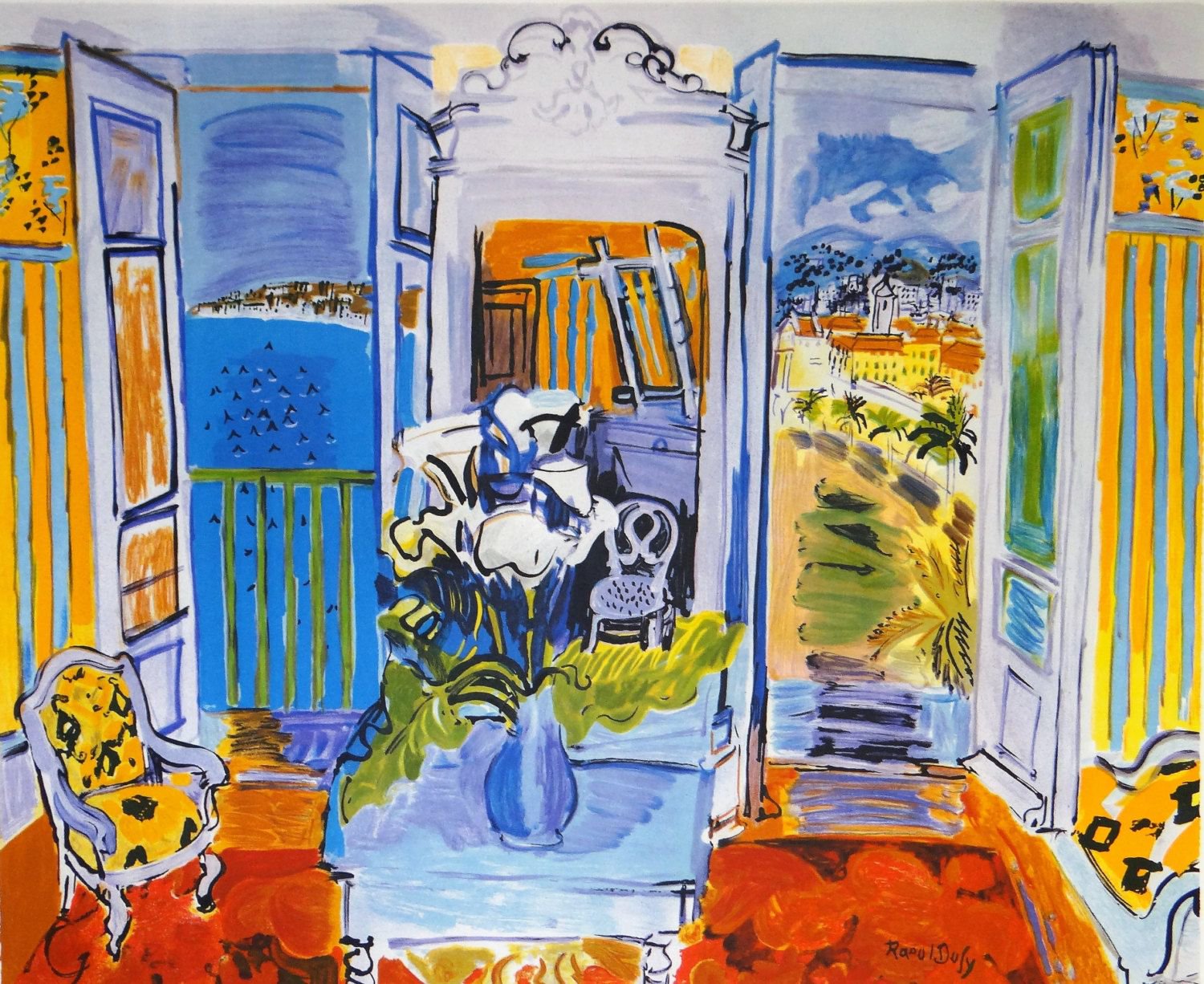
Raoul Dufy’s 1928 “Intérieur à la fenêtre ouverte” depicts the view of the Baie des Anges in Nice.
Artists like Picasso, Matisse, Chagall and Dufy were also all drawn to the Riviera for its bright luminosity that were depicted in their famous works of art.
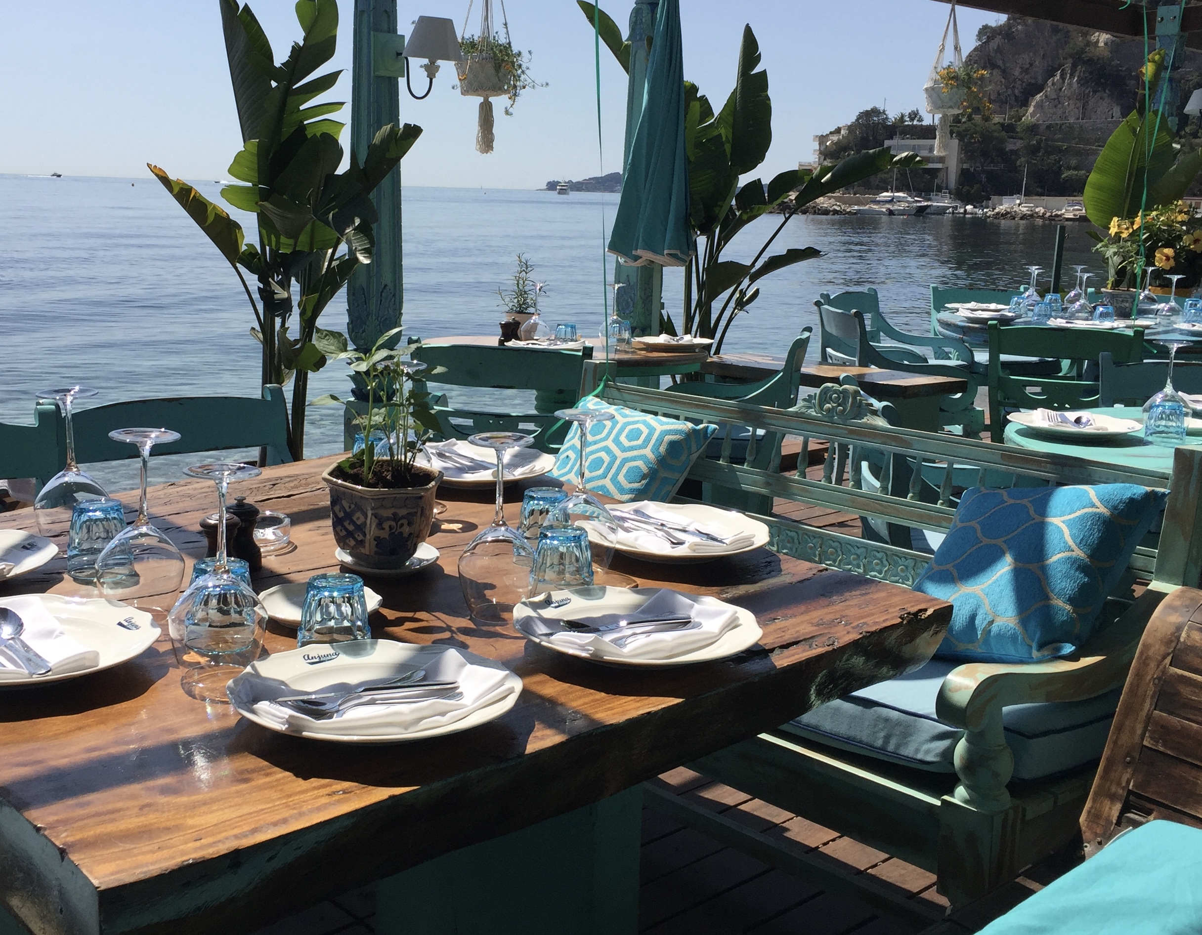
Anjuna Plage in Eze sur Mer, a favourite local seaside eatery where we often lunch with our clients.
Rooted in Provencal Charm
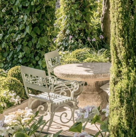
Whether you are seaside or countryside, the Provencal charm is tied to the territory through the simple architecture, agriculture and gardening, nature, cuisine, and joie de vivre.
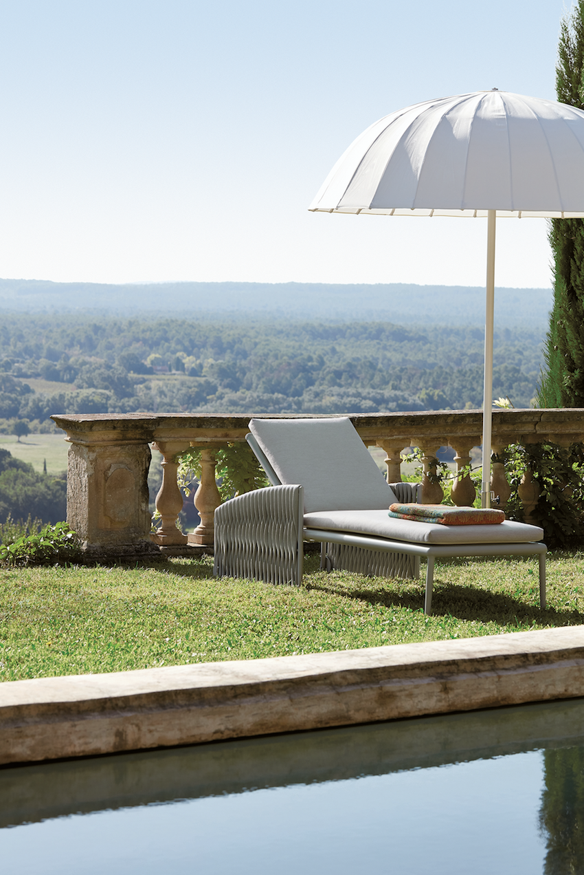
Photo by SIFAS.
The joy is in appreciating the simplicity because the surroundings speak for themselves with their natural beauty.
Dining al fresco under the pergola of wisteria with friends and family, and enjoying locally grown products like olive oils, cheeses, and wine in connection to this coveted Mediterranean territory.
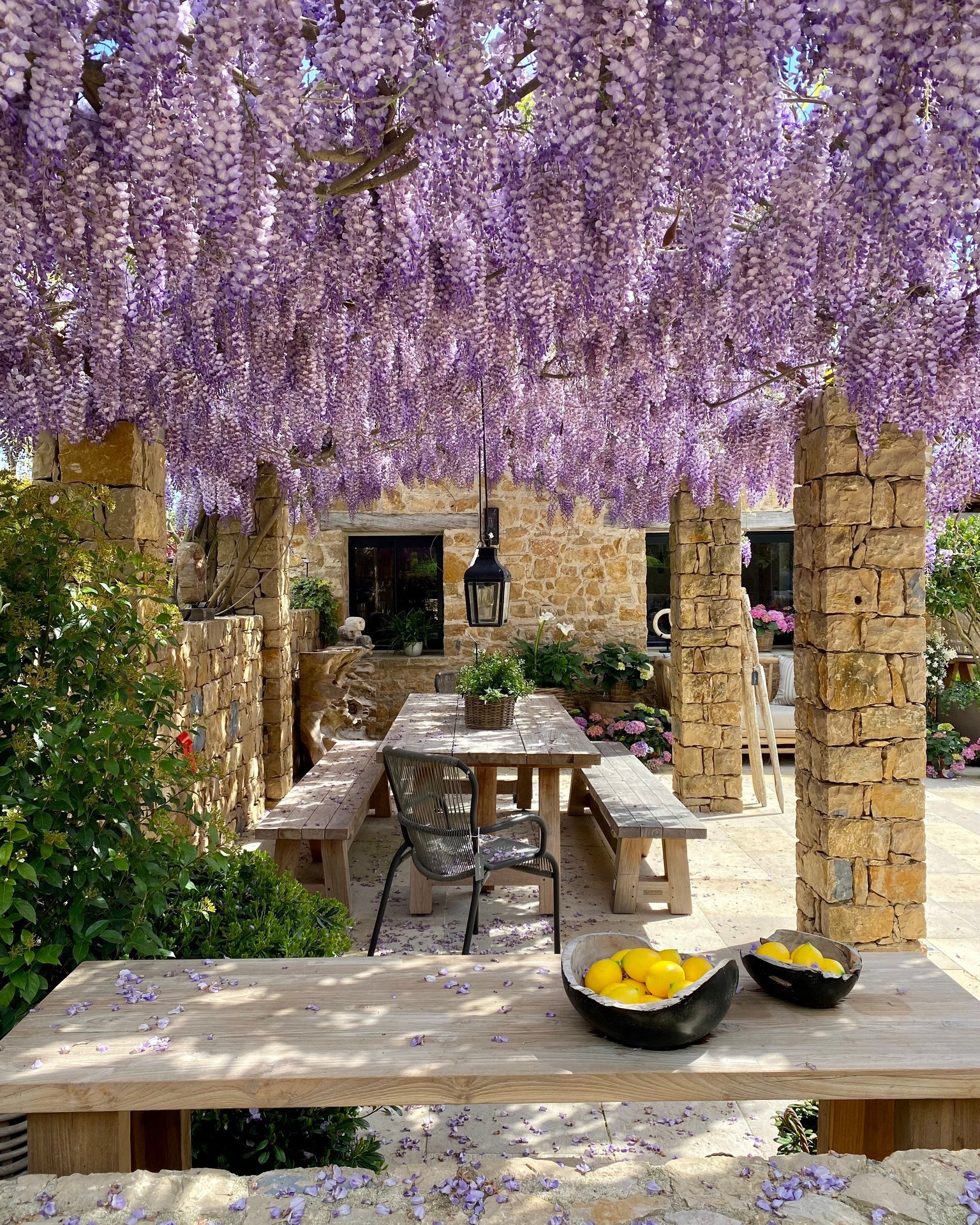
Callender Howorth works with English Garden Group to create memorable outdoor landscapes and living areas.
Irrefutable Elegance and Class
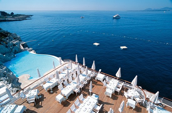
Photo by Hotel du Cap Eden Roc
The French Riviera heralds some of the most beautiful hotels with undeniable elegance and class such as the Hotel du Cap Eden Roc nestled in the rugged scenic coastline of Cap d’Antibes.
A timeless legend of carefree elegance and inspirational beauty.
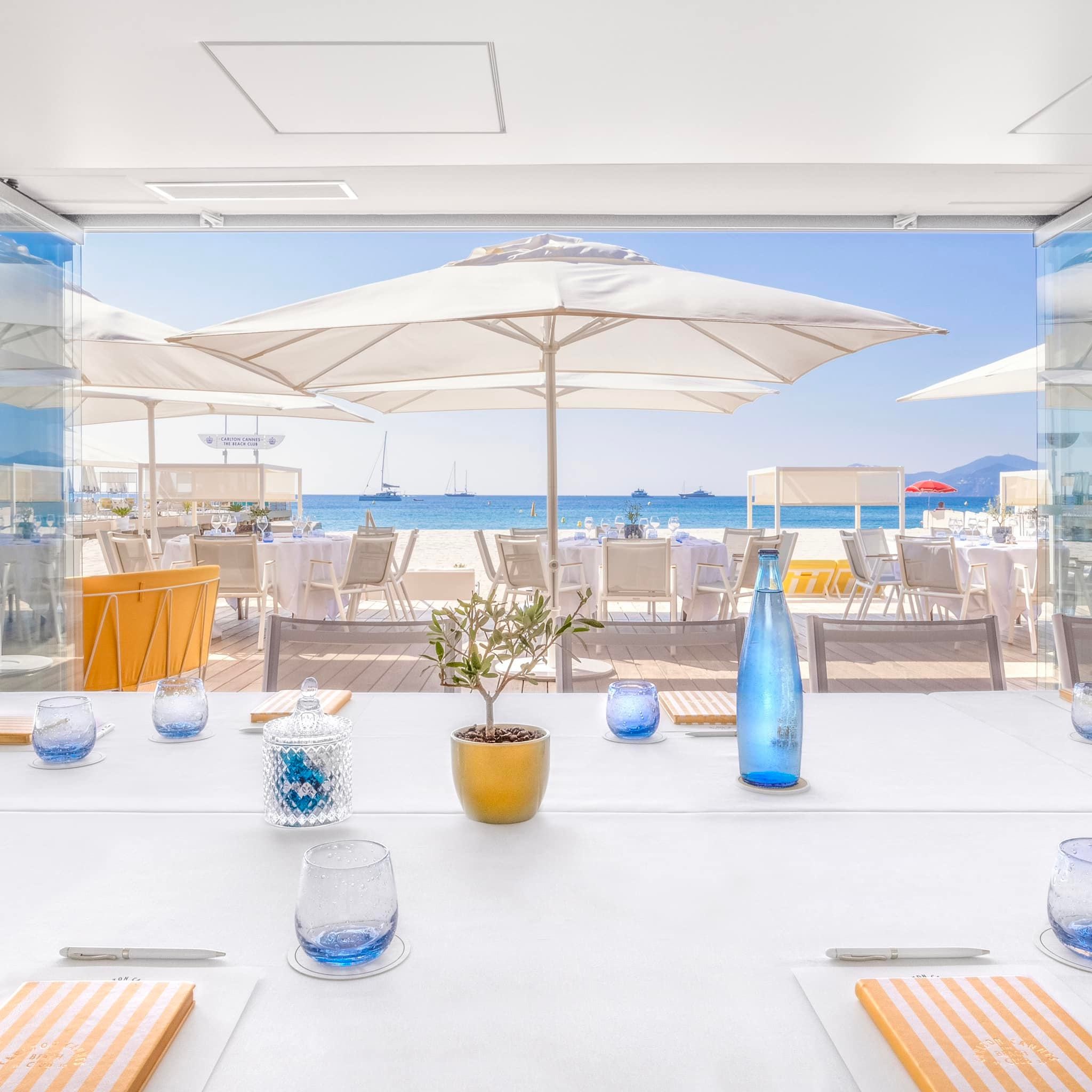
Photo by Carlton Beach Club.
During the Cannes Film Festival, A-list celebrities and film are usually spotted in the Carlton Beach Club soaking in the Mediterranean sun.
A Lifestyle of Outdoor Living
A signature mark of living on the French Riviera is the year long indoor/outdoor living lifestyle.
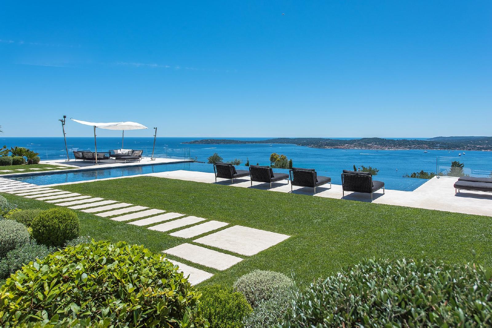
Photo by Carlton-International. Luxury seaside property in Grimaud, St. Tropez’s quiet neighbour.
Touting 300 days of sunshine a year, the most exclusive homes are designed with the intention of enjoying the glorious sunny weather all year. The focal point is the terrace, whether is a sea view terrace or niched in the Provencal countryside.
The natural lighting of the Riviera is quite unique which makes designing the interiors of luxury homes quite interesting in that the interior lighting designs complement the vast arrays of ever changing natural light streams.
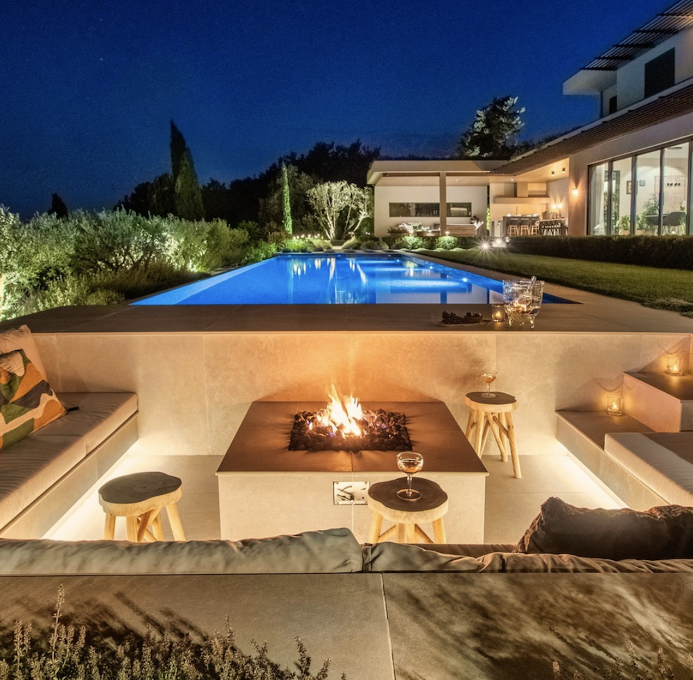
Photo by English Garden Group. Sunken lounge for a cozy night under the stars.
The French Riviera is a distinct blend of old and new, a harmonious contrast that carries with it an inspiring carefree spirit.
Perhaps the French way of admiring the simple things in life such as a beautiful flower market like the Cours Saleya in Nice, an afternoon pause for an espresso al fresco or a seaside aperitif to watch the sunset, reminds us of the beauty of the simple pleasures and making simple pleasures beautiful.
Here is a sneak peak of our current project for a sea view villa in Villefranche-sur-mer.
Rendering by Callender Howorth for current project in Villefranche-sur-mer.
View of the bay of Villefranche from Callender Howorth’s renovation project for a luxury villa.
For our projects in the south of France we infuse this essence of enjoyment along with the energy of refined organic materials and natural light to create living spaces whose beauty and comfort are effortless.
Whether you are having a picnic on the beach, 5-star fine dining, or renovating your home, the essence of Riviera style is in the effortless spirit of enjoyment.
Styling in New York
It’s such a nice feeling to be back in New York now that travel has opened back up again.
Perhaps it’s a newfound appreciation of life moving forward after the pandemic, but the city seems more vibrant than ever!
Central Park
As we work on an interior design project for a penthouse in Central Park South, we find ourselves gazing out to the gorgeous views of Central Park and how the beauty of this park, an icon of the New York lifestyle, plays such an important role to New Yorkers.
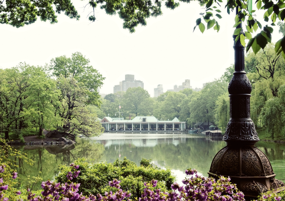
The romantic setting of the charming Loeb Boathouse.
Apart from the classic horse and carriage rides that appeared in so many films made in New York, Central Park is an urban oasis of activities like feeding the penguins at the Central Park Zoo to Sunrise Morning Yoga Walks, winter Ice skating at Wollman Rink, to the landmark charm of lunching at Tavern on the Green or dining lakeside in the romantic setting of the Loeb Boathouse.
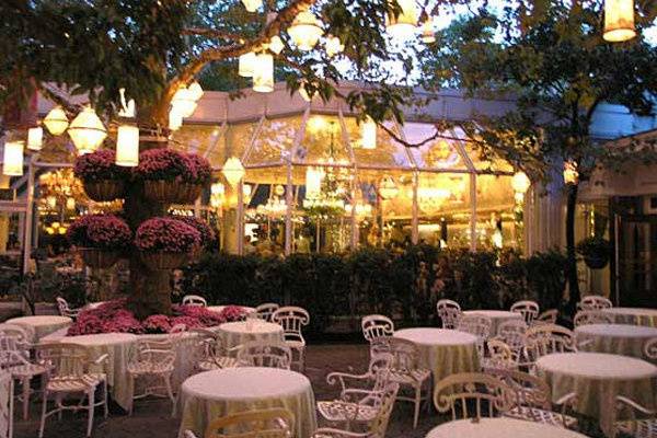
Central Park’s classy landmark restaurant Tavern on the Green.
The elegant charm of Manhattan underpins the beauty of Central Park, and as we begin working on another penthouse project here, we can’t help but hear Sinatra’s signature melody New York, New York! Campy, but it gets us every time !
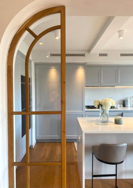
Callender Howorth penthouse interiors project in Central Park South.
Styling for this project will capture timeless elegance while being easy and effortless to live in.
The apartment will reflect our client’s signature unique style while reflecting the sophistication of the Central Park lifestyle.
The Hamptons
The second part of our trip takes us to the Hamptons in Long Island.
Known as a rural summer getaway from the city for the rich and famous, the homes on the Hamptons are as famous as the hedgerows that hide them as well as the perennial American Beach Grass of the East End.
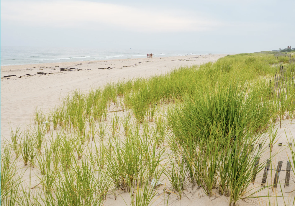
As we work on an interior residential project here, we can feel the relaxed and laid-back atmosphere of coastal living. The coastal breezes, quaint village shops, gourmet farmers’ markets, flower shops, and stylish boutiques all carry the underlying grace and grandeur of living in the Hamptons.
Our residential interiors project will combine the essence of refinement and class with the ease of understated elegance as a thread to the natural charm of its coastal environment.
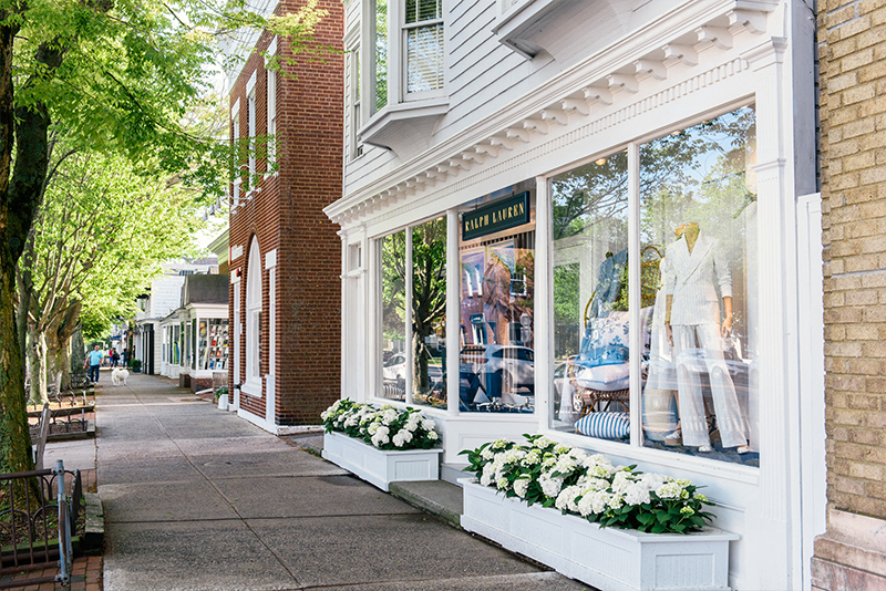
Classic village elegance in Southampton.
Whilst the contrast of the Hamptons with Central Park is palpable, the proud American spirit is what ties them together. Much like back in the UK where the British sentiment and spirit reign supreme in its traditions and style.
Callender Howorth’s residential interior project in Southampton.
As we continue the completion of our current projects Central Park and the Hamptons, we are beginning to prepare the next round of projects in these famed areas of New York.
The Art of Unexpected Discovery
At the beginning of every year, most of us find ourselves looking ahead at what the new year will bring. We set out to define our goals and ambitions and align our minds with the intentions of what we would like to experience for the coming year.
A fresh start with subtle anticipation of those unexpected surprises that tend to shape our lives with meaning and context are planted like seeds in our minds.
@Courtesy of Euphoria Retreat
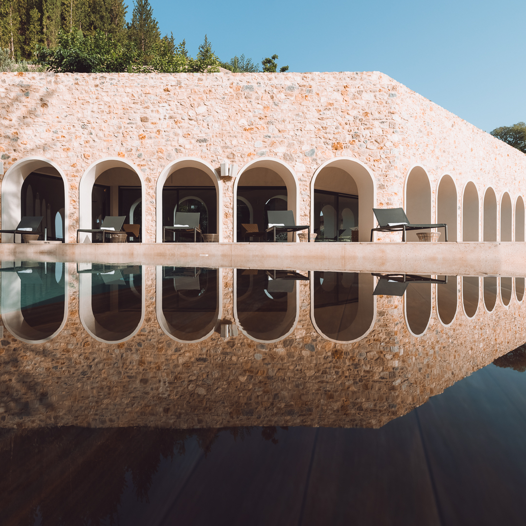
On the Peloponnese peninsula of southern Greece, a mythical and historically rich area on the Mediterranean, Euphoria Retreat is nestled in the serene countryside dotted with olive groves, authentic villages, and pine forests.
A magical landscape where the symbiotic relationship of nature and culture is present, Euphoria Retreat is an idyllic place that inspires profound reflection of the depth and meaning of the intimate relationships we have with our physical environments.
Our relationship to the spaces we inhabit is something we experience on a daily basis, yet for most its a dynamic that goes unnoticed until we visit certain places that are awe-inspiring.
We seek to be inspired, surprised, and impressed, yet our day-to-day routines tend to produce feelings that are predictable, safe and familiar.
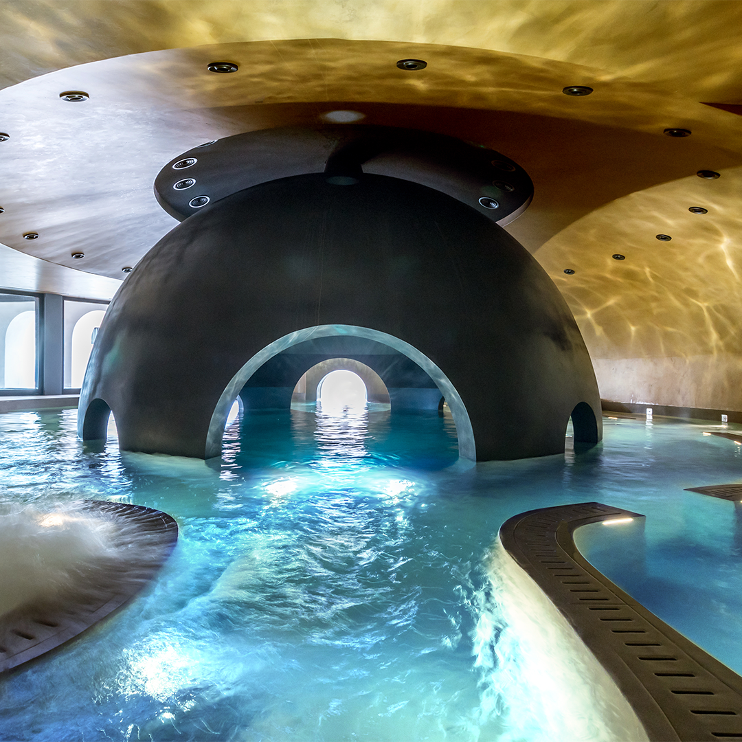
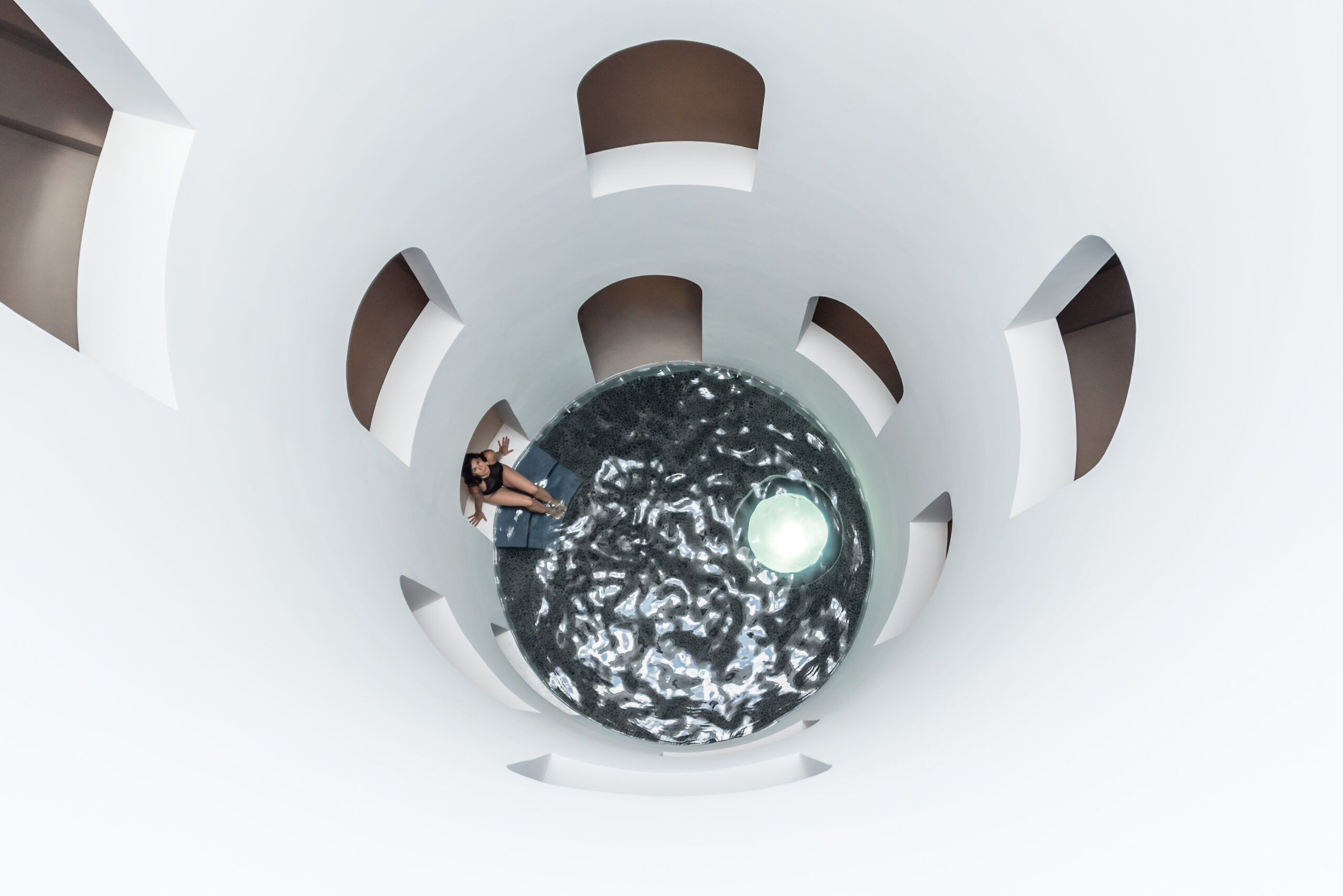
Sphere pool. @Couresty of Euphoria Retreat
The Greek quote in Euphoria’s literature succinctly sums up the idea of discovery, “If you do not expect the unexpected you will not find it, for it is not to be reached by search or trail.”- Heraclitus
Euphoria’s organic earthy tones on the walls, the circular curvatures of the Waterwell Kneipp Therapy, or the orb-shaped Sphere Pool are designed to visually provoke meditative states of stillness and wonder which awakens all the senses.
Waterwell. @Courtesy Euphoria Retreat
These spaces act as a portal into self-discovery with the euphoric feeling of being in the caverns of one’s own consciousness. A mindful introspection is almost inevitable as a sense of curiosity is naturally piqued in these thoughtfully designed spaces of healing.
A Subjective Relationship to Colour and Space
Apart from the sense of discovery through spaces, colours have the psychological power to affect our moods and evoke certain feelings. In colour psychology, colours are divided in to 3 main categories, warm, cool and neutral.
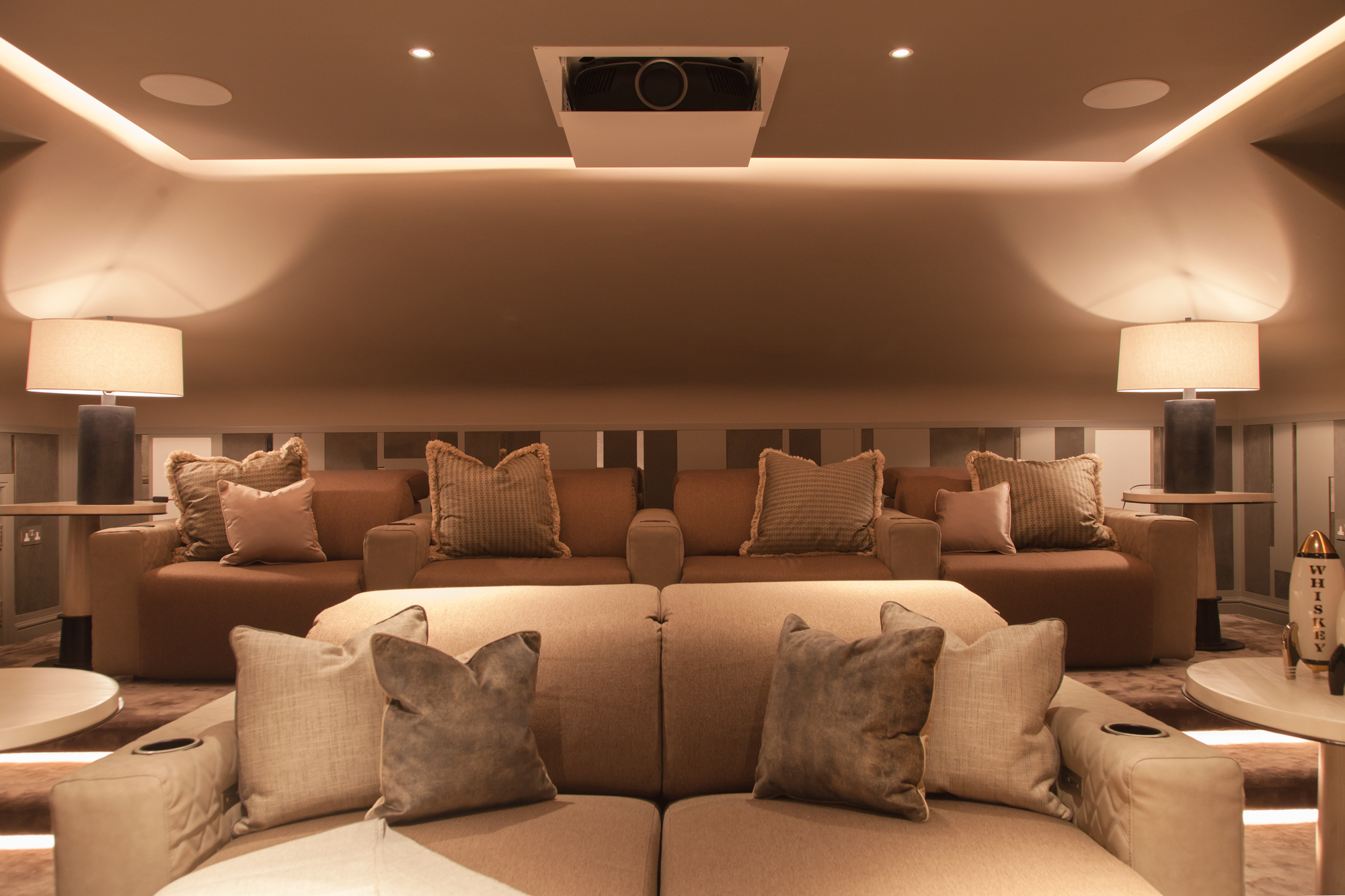
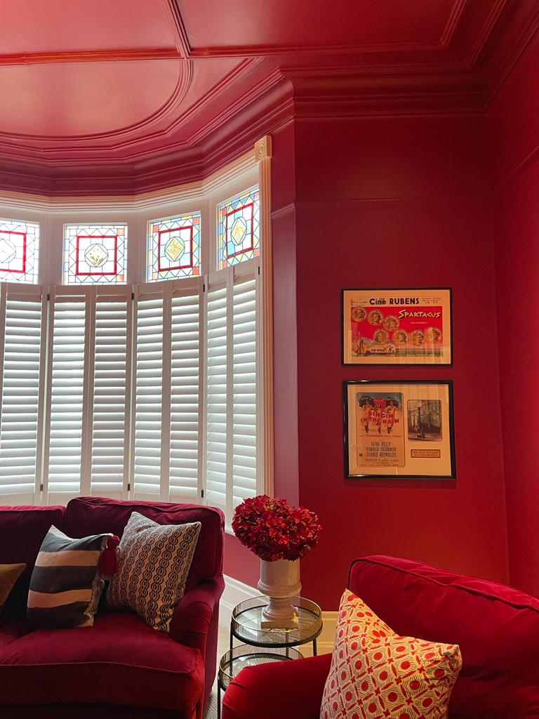
A combination of warm textures and and tonal lighting were used in the Contemporary Country House project by Callender Howorth to create a cozy and true cinematic effect for the home cinema.
Warm colours such as reds, oranges and yellows stimulate a sense of love, passion, excitement, as well as social interaction.
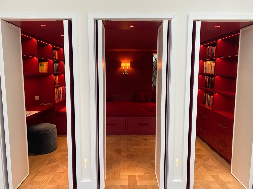
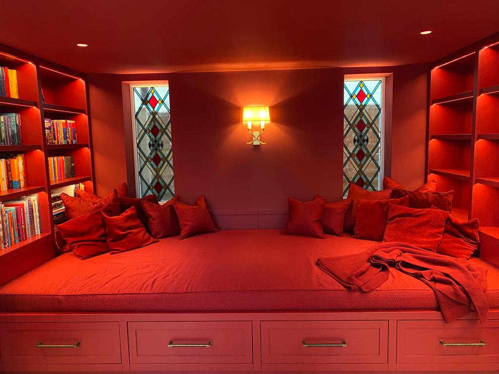
Snug shot from Callender Howorth residential project in Twickenham. Pockets of mood and colour add excitement and energy changes to our interior design .
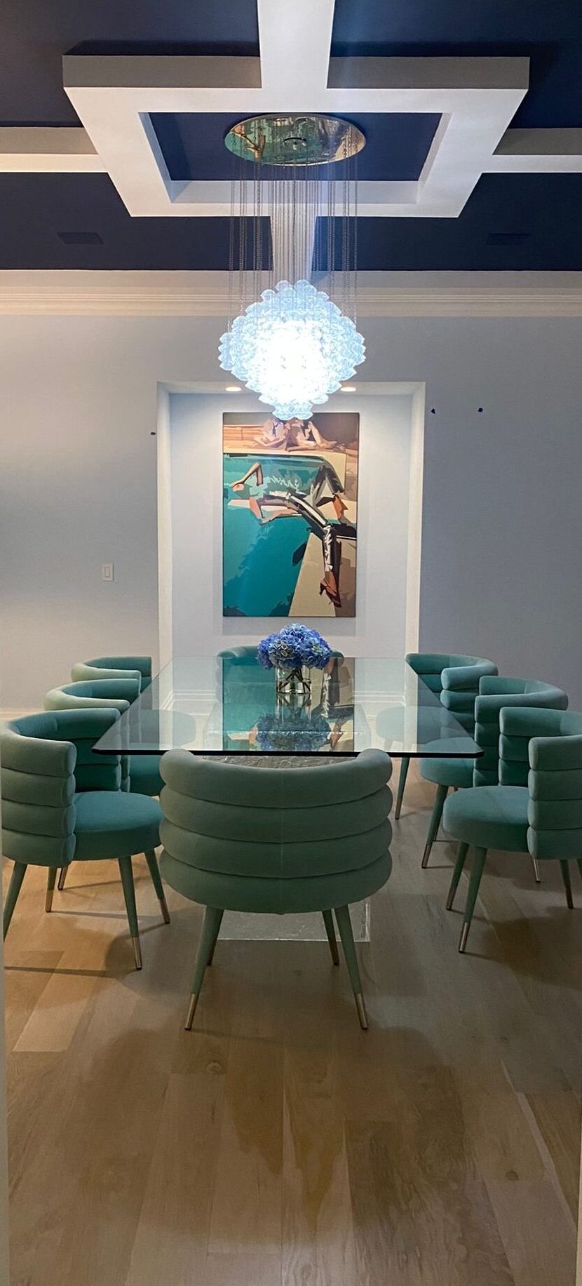
Cool colours such as blues, greens and purples evoke feelings of calm and relaxation as well as balance, creativity, mystery and luxury.
Bloomfield project by Callender Howorth
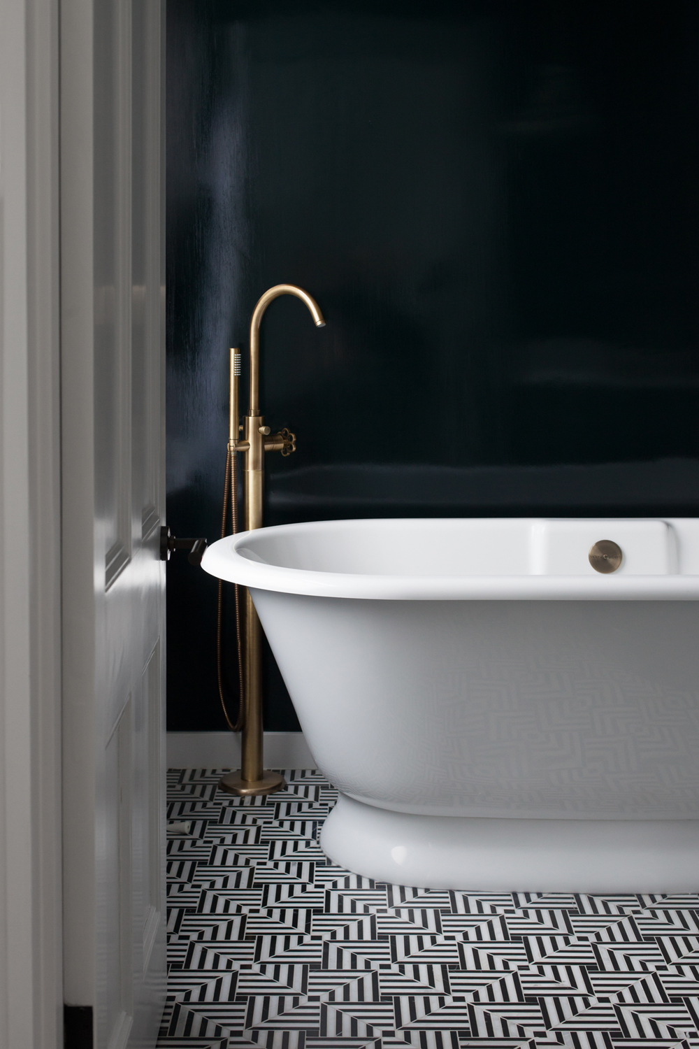
Neutrals such as white, beige, greys and black provide a sense of purity, elegance, wisdom, comfort and a natural aesthetic.
Residential project in Twickenham by Callender Howorth
Perhaps one of the most notable works of colour were by Russian artist Mark Rothko whose hazy thin washes of colour brought a different luminosity to the contrasting shades of the large expanses of colour. As an Abstract Expressionist Rothko’s signature large-scale coloured rectangles used simplified means to evoke emotional responses.
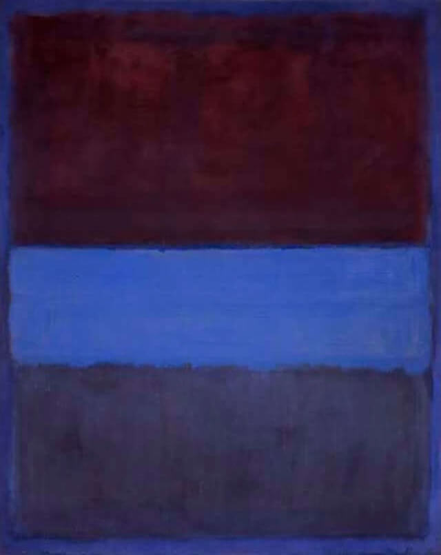
Rust and Blue by Mark Rothko, 1953 @Mark-Rothko org
The psychological sense of the unexpected is what disrupts our thought patterns and it is from this place where a new relationship between us and our environment is created.
Visual and auditory experiences become intrinsically familiar but at the same time, spatial ambiances that are distinctively unexpected unconsciously shift’s one attention.
This dynamic of shifting our attention away to something unexpected prompting pleasant, positive, comforting, and safe emotions is the basis of the psychology of space.
Psychology of space is in fact “the study of human relations and behaviours within the context of the built and natural environments” -Dave Alan Kopec
The design principles such as balance, symmetry, function, movement, and proportion are what we as designers use to invoke a natural harmony in order to evoke the mood we seek to achieve.
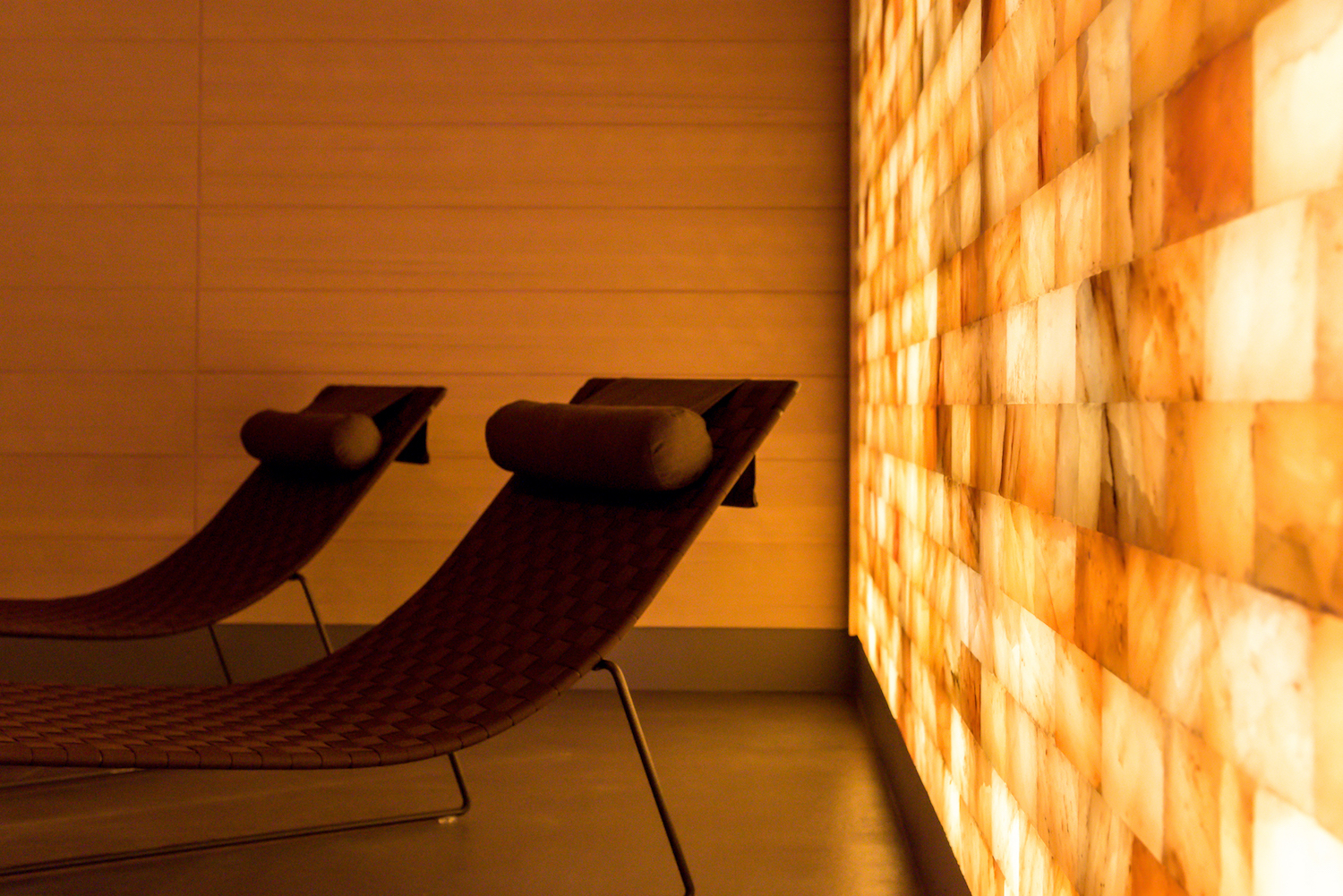
Salt Room, Euphoria Retreat
So going back to the concept of the unexpected aesthetic, we garner the wisdom and sympathetic value of a mindful and deliberate way to discover those parts of ourselves that would otherwise go unnoticed.
And in doing so, we appreciate the gifts and growth that come from the art of unexpected discovery.
Journeys in Time
A personal message from Mark Howorth
As we find ourselves amidst the holiday season, I find myself thinking about the significance of time, particularly our journeys in time.
The holidays mark an intentional moment to celebrate a year of life, and it certainly comes with all what may! We celebrate personal and professional successes, cherished milestones, new dreams and discoveries, and the musings of forgotten memories, welcoming a new life or the passing of a loved one.

Such is the case for myself as it’s been almost 2 years since my fathers passing, yet it still seems like yesterday we were together in the south of France enjoying the cafes and driving along the beautiful coast of the Cote d’Azur.
A place that was so dear to my fathers heart and where I spent my childhood summers going to all the provincial beaches with my family and sailing on the beautiful Mediterranean.
These memories warm my heart.

John Howorth
Life’s dual nature of beauty and chaos tugs on my emotional heart strings as such memories simply makes me miss my loving father even more. Yet I am comforted by the thought that I always carry his presence in my heart.
Our hearts, the space within us where all our stories are deeply felt.
We seek the stories whose framework will inherently hold the context we seek to describe. The story within us that is wanting to emerge and reveal itself as we live each moment in the unfolding of our journey in time with each other.
By sharing this vulnerable aspect of ourselves, we connect on a deeper level of compassion and kindness.
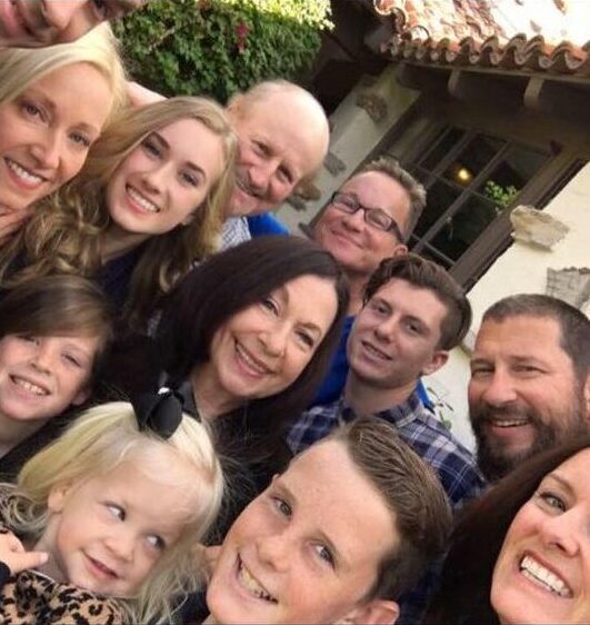
The Howorth family.
We relish in our funny stories, embarrassing moments that make us laugh until our bellies hurt, as well as find comfort in the moments that call upon our emotional reserves of resilience and courage when we most need a shoulder to cry on.
But isn’t this what life is all about?
Bearing witness to each other and all our experiences in our journey of sorting it all out. Making sense of it all, especially during these trying times with the pandemic which has sparked the flame of vulnerability in all of us.
The people in our lives give us profound meaning and inspiration to be and discover who we really are.
They are gifts of grace.
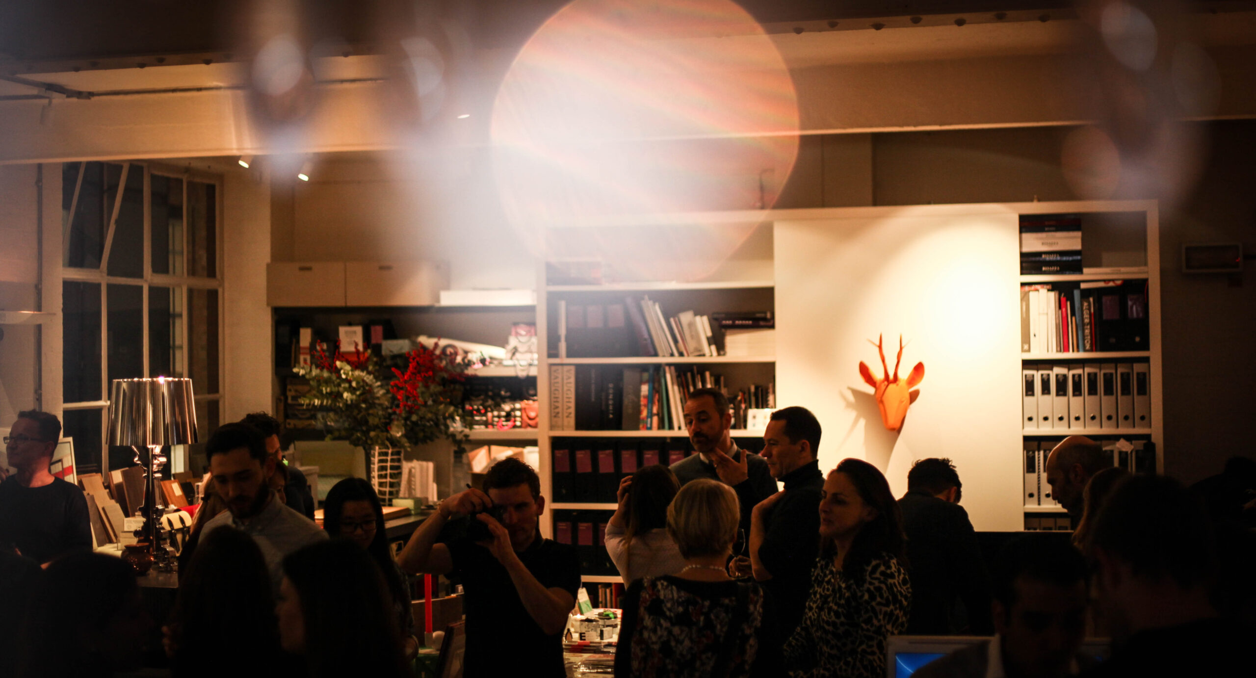
Looking back at the Callender Howorth Christmas party we had in 2019. How fun! We are sure to have a party next year!
I would like to extend my complete gratitude and thanks to the entire team at Callender Howorth, along with our suppliers and business partners for all their work that allows us to deliver excellence in interior design to our clients.
And to all our clients, thank you for your trust and loyalty, we are sincerely honoured to be a part of your journey.
It is with my deepest heartfelt intention, that I wish for all of you this holiday season, to reach out with one another, and let it be a moment in time filled with appreciation and blessings for these are the journeys in time that we share together.
Main image: Callender Howorth project Chalet Solaise in Switzerland. Photo by Andrew Borthwick
 |
 |
 |
 |
 |
|