Chromotherapy: Colours and Their Effects
December 8, 2016

Lately there has been much talk of chromotherapy. The concept behind this technical sounding term is not a new one – it actually dates back thousands of years. Light in the form of colour is thought to balance the body’s energy, and thus influence a person’s well-being on physical, emotional, spiritual or mental levels. What ancient Chinese healers, Indian practitioners of ayurveda, and the great Avicenna believed millennia ago, has recently made a comeback in holistic healing. Knowing the effect of colours on a person’s mood and feelings, luxury interior design company Callender Howorth puts much thought into its colour schemes to create the desired effect. Let us have a look at the principal properties ascribed to specific colours.
Red
The typical colour of state rooms, regal red symbolizes power, energy, courage, and of course love. Also often found in dining rooms, it is said to have a positive influence on appetite. While it warms up any room, too much of it can overstimulate the senses. Today’s interior designers therefore prefer to use it sparingly, as an accent rather than the dominant colour scheme, as it packs enough punch even in small doses to create a vibrant, convivial atmosphere.
Blue
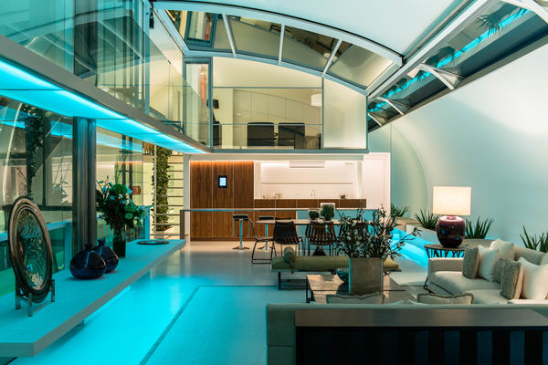
The world’s most favorite colour is typically associated with trust, intelligence, and calm. Soothing blue is also the second most prevalent one in nature after green. Thinking of the blue sky or the blue sea triggers a sense of space and serenity. With its additional connotation of sophistication, blue is therefore a colour perfectly adapted to city living. Despite its dark hue, even a predominantly blue room will not look cold or uninviting if carefully paired with complementary colours.
Recommended for you: Interior Design Trends for 2017
Yellow
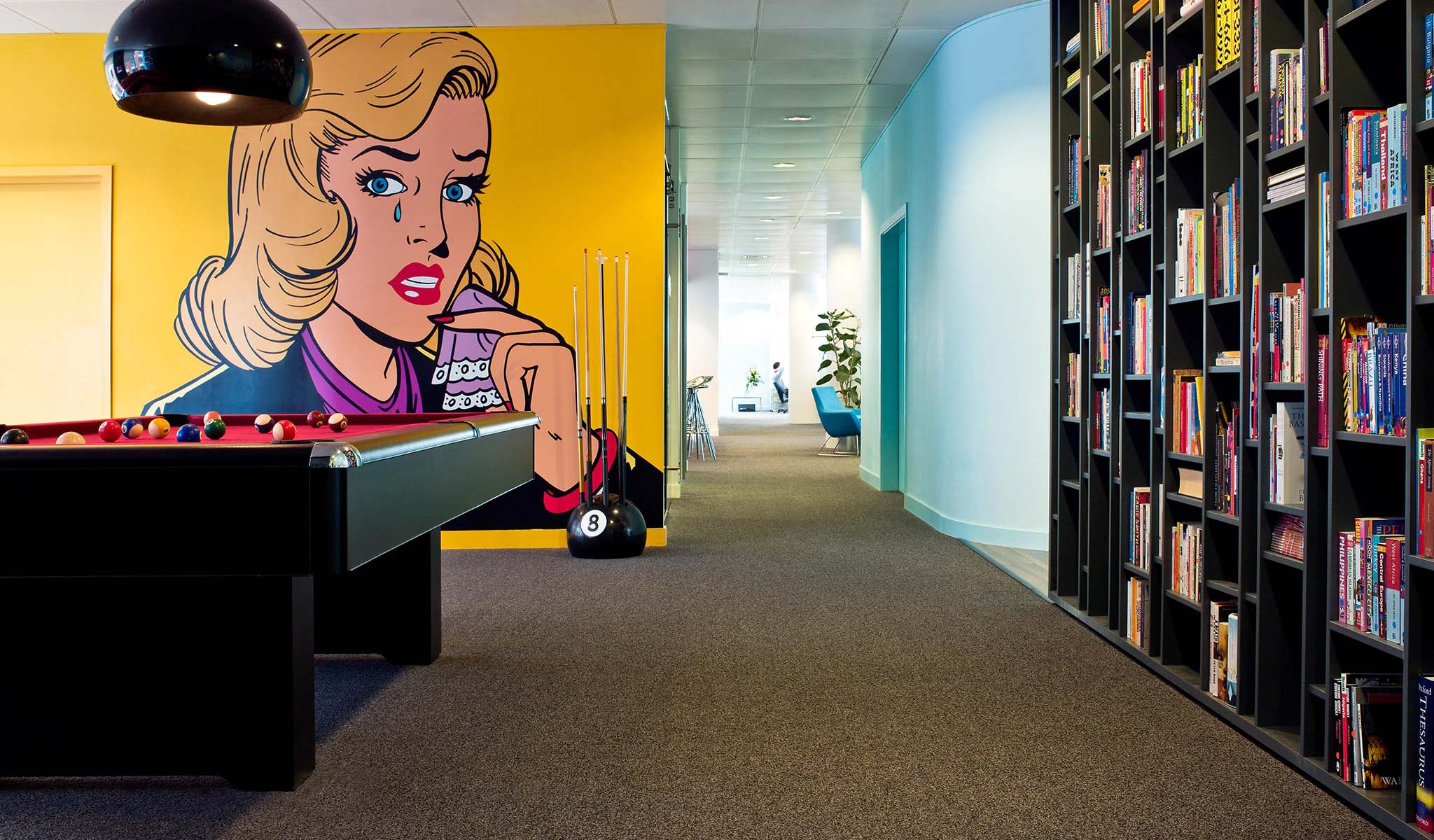
The colour of optimism, confidence, creativity and extraversion is closely connected to the qualities ascribed to red but is considered more cheerful. Reminiscent of sunshine and flowers, yellow is the colour favoured by the young and creative. More and more young, dynamic companies use its invigorating, energy-boosting power, such as the Commercial HQ of Flamingo International. A caveat in the living space though: it has to be carefully dosed in order not to overpower a room. An accent piece of furniture, a fabric, or a painting can already create the desired effect.

Green
The color of nature is synonymous with harmony, equilibrium and nurture. Restful to the eye, it is often used in spaces dedicated to restoration and healing. It is also the color of money in many currencies. The presence of green in a room is therefore a subliminal reminder of abundance and wellbeing on every level. Interior designers like to use it to create an oasis of calm, mixing green layers and textures as a reminder of the outdoors.
White, Grey, Black
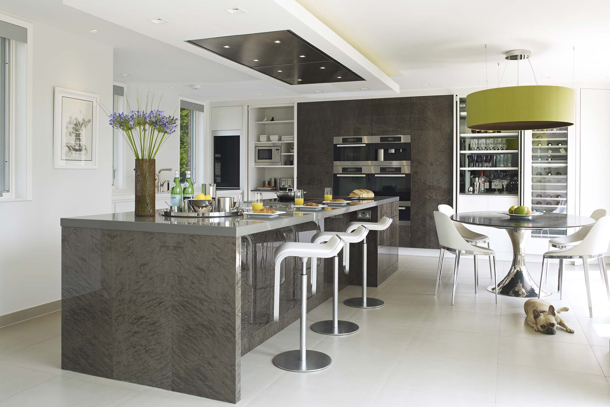
Innocent white, neutral grey, discrete beige, and sophisticated black are surprisingly versatile colours that share a commonality: the theme of peace and safety. True team players, they pair well with other colours, setting off their peers’ qualities, but they are strong enough to make a statement all by themselves. They can blend to subtle combinations or can create bold contrast – either way their sleek, modern, understated look gives a sense of tranquility, as can be experienced in the Essex Mansion Project. And nothing brings out their true beauty than one well-placed accent piece in a different colour.

Chromotherapy is the art of listening to one’s instinct and senses, and translating them into a choice of colours most suited to enhance one’s well-being. The expert designers at Callender Howorth are on hand to offer their professional advice and oversee your project.


