Minimalist Design Approach: Tips & Ideas
January 6, 2017

Less is more. Nowhere is the old adage truer than in one’s living or work space. An uncluttered environment reduces visual distractions, leaving more room for focus and creativity. To achieve this, our team of luxury interior designers relies on some key techniques.
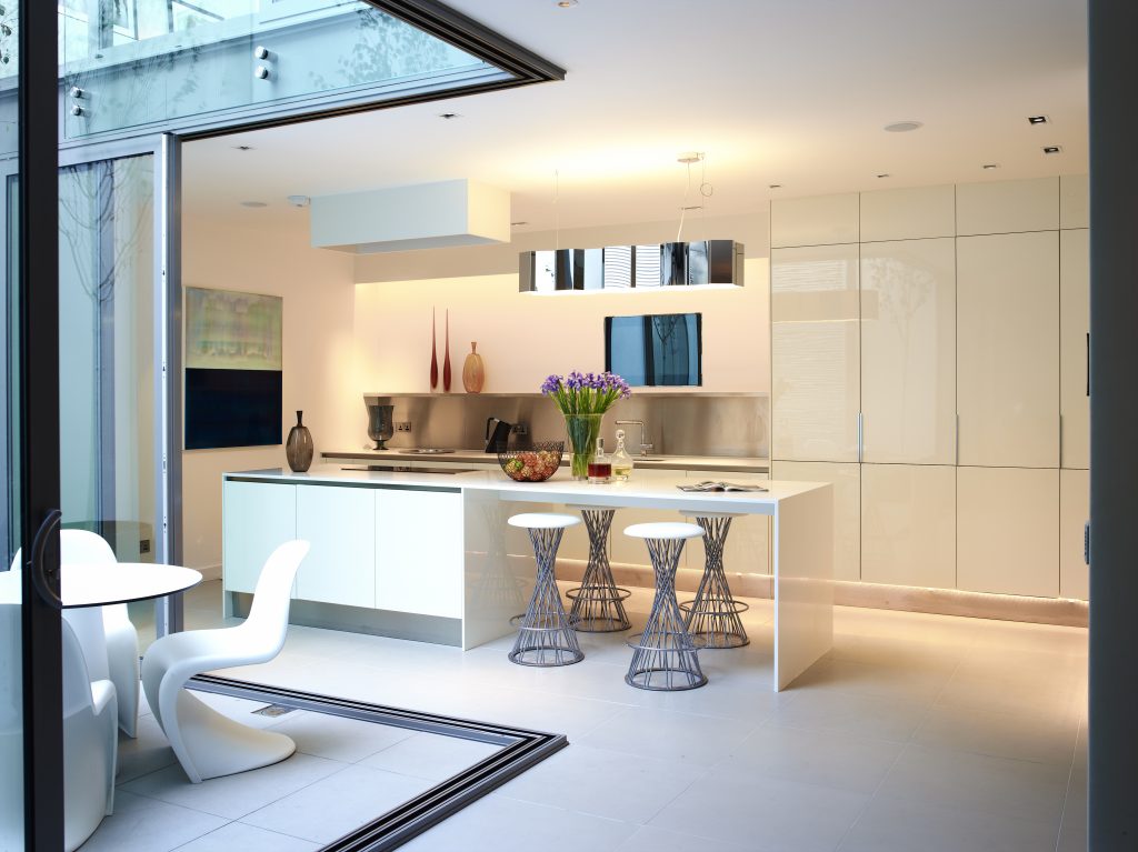
Clean lines bring structure and order to a room, and create the impression of a larger space than it may actually be. If the eye can easily process function and make sense context, it sends the brain a signal to relax. As a result, we experience a sense of well-being and safety. To avoid that pure lines look formal and cold, well-balanced layers and (sparingly used) contrasting shapes create depth, visual interest, and warmth. Large walls can be broken up by a plant or a vase of flowers, geometric symmetry is softened through round accents such as a lamp or the gentle curves of a chair. The use of plush fabric also helps to break geometric uniformity.
Using a colour palette within the same family is another key element to open up a space and create a sense of zen. This does not necessarily mean that colours have to be bland or monochrome – on the contrary, they can run the gamut from light to dark, with contrasting patterns creating a lively interplay. The key is simply to decide on one base colour and then mix and match it in all its glorious variations. Juxtaposing natural materials such as exposed brick, rustic wood, or terracotta tiles with noble ones like leather, silk, or cashmere creates an extravagant contrast with a discreet hint of luxury – a style that is both contemporary and timeless.
Nothing says “sophistication” quite like the conscious reduction to one dramatic focal element. Maybe it is already a natural part of the space, like a panorama window wall or an exquisitely handcrafted staircase, maybe it is an addition to the décor such as a bespoke piece of art or a statement instrument like a grand piano…. Either way it impregnates the environment with its owner’s personality and deserves to stand out. Ban the exhibit of collectibles – the authentic Renoir or Dali paintings excluded, of course – and instead shine the spotlight on that one grand showstopping piece.
These three guidelines – clean lines, a tight colour palette, and an eye-catching piece of art – have been expertly applied to this luxury apartment in Nice, France which is a study in minimalistic design paired with an inviting living environment.
Suggested for you: The Nice Apartment Renovation – Before and After
The same principles apply to offices where a clean and uncluttered environment is proven to increase productivity and a sense of identification with one’s surrounding. This case study of our recent refurbishment project of the Flamingo commercial offices in London shows how creative chaos has been tamed and transformed into a world of zenitude with a modern twist.
Our highly experienced team of award-winning luxury interior designers knows how to bring out the best features of any space, always with a keen eye on aesthetics of course but – equally important – also a genuine concern for the well-being of its occupants. We are delighted to answer your questions and assist with your projects.


