Coherent Contrast
May 12, 2021
We live in a world of contrast.
Light and dark, thick and thin, happy and sad, yin and yang, simple and complex, night and day.
The dual nature of our universe gives us contrast, which sometimes can be good, and of course, can sometimes be bad. As the adage goes, there are two sides to every coin and two sides to every story.
Why is contrast important?
First and foremost, our lives would be quite boring without it! Mundane, uninteresting, and bland.
Much of what we desire emerges from the experience of contrast within our lives and what we see in our surroundings.
Contrast gives us an opportunity to see and understand something from another perspective. It helps us see and feel things that we might not have noticed or felt otherwise.
And that is how inspiration is born.
In the context of visual design, contrast is simply the difference between two or more elements in a composition. The greater the difference between them, the easier it is to compare and understand.
The object that is most obvious and that stands out is the object with high contrast known as the primitive object. This is where our eye in our visual processing goes first, even before our consciousness.
In our Regents House Project, we used a large piece of artwork in monochromatic crimson to contrast the depth of this spacious white bathroom bathroom for a bold yet minimal, modern feel.
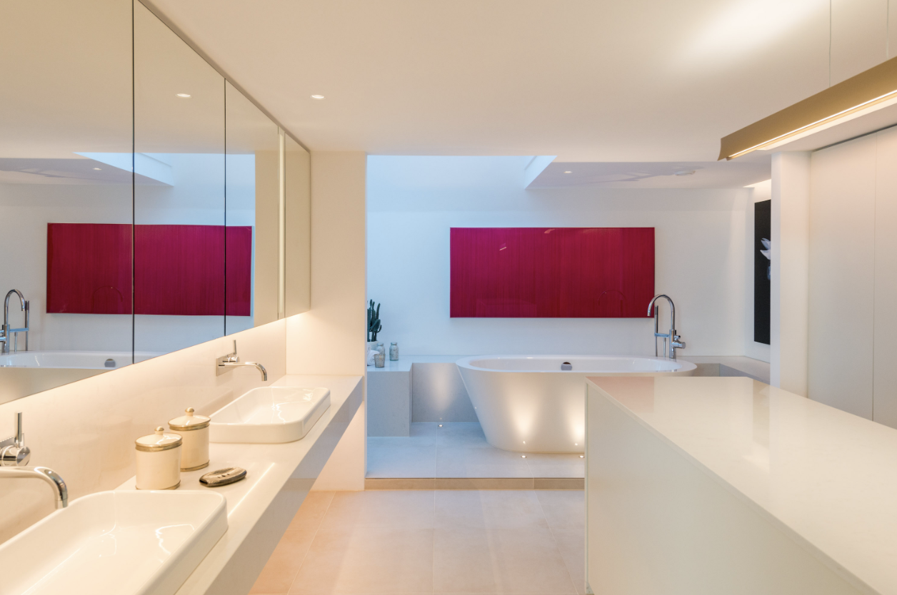
Regents Park House project by Callender Howorth
Some typical primitive objects are size, colour, depth, shape, motion, orientation, curvature, line terminators, and closures.
The Wow Factor
Ever walk into a room and immediately be taken in by the Wow factor?
For interior designers, contrast is the secret design principle that originates in our cognitive bias when we view two elements with opposing characteristics.
Our perception is then one of comparison known as the contrast effect.
We compare two elements in order to understand the differences between them such as making something appear lighter when it is placed against a dark background.
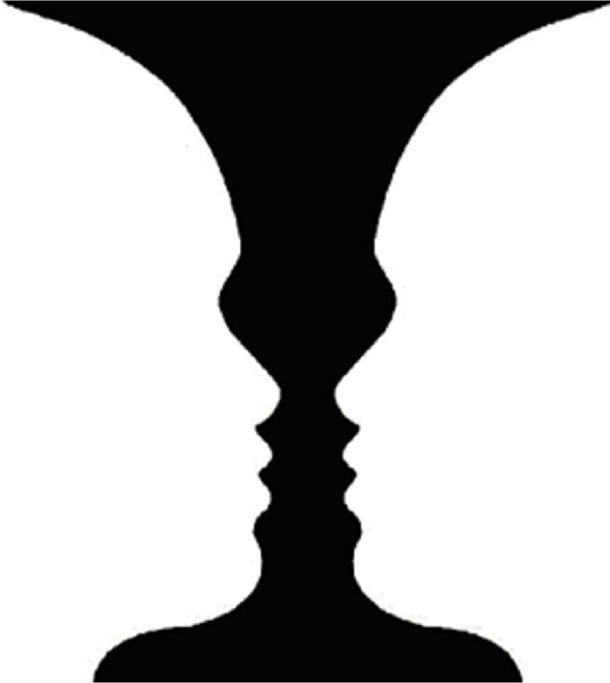
The most known example of visual perception of contrast is the Gestalt psychological concept of figure-ground where one sees a form or figure and its surroundings or ground.
The use of positive and negative space determines what the viewer will see. Gestalt theories of perception are based on human nature being inclined to understand objects as an entire structure rather than the sum of its parts
Contrast in Design
When you have the Wow factor of space, what you actually are witnessing is the proper use of contrast in design.
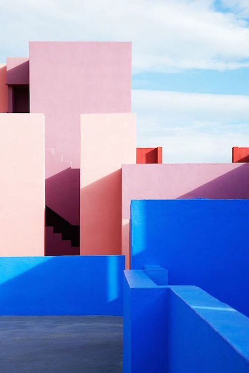
Contrast with lines, forms and large objects.
Contrast creates a memorable impact and visual interest by coherently pulling the whole room together.
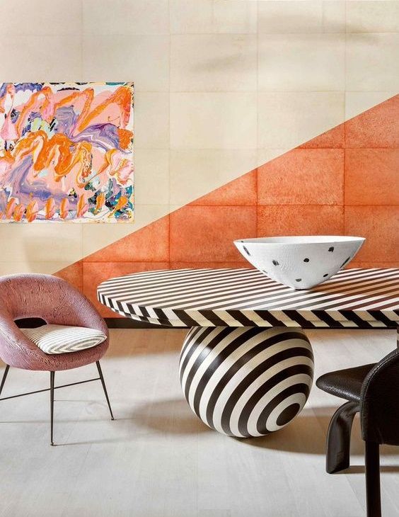
Contrast in colour, pattern and movement.
Colour is the key element in interior design.
Contrast can be created in monochromatic variations, in the use of bold colours and levels of intensity, in patterns and textures, and in lighting.
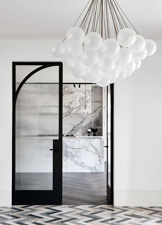
In our Mayfair Mews House project we used natural light to contrast the darker tones in the living room with an impressive large glass wall partition.
Capturing all the natural light from the skylights above the staircase, the darker tones of the living room were contrasted with the visual impact of the staircase. The living room feels open and airy with a larger sense of space coherent with the light and space from the interior garden.
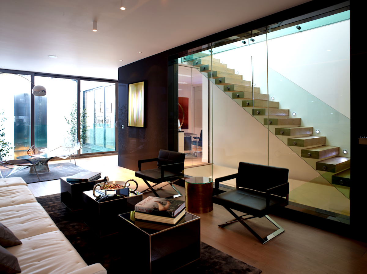
Mayfair Mews House project by Callender Howorth
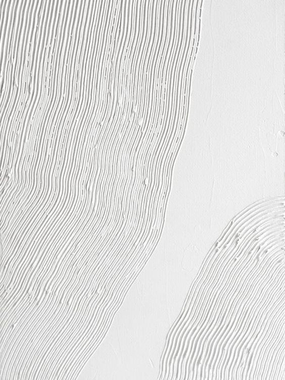
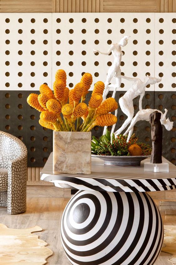
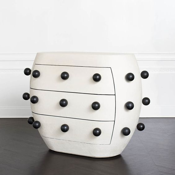
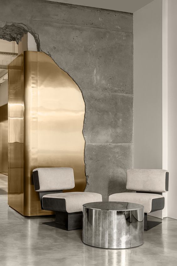
Monochromatic contrast with texture.

Contrast with colour and placement.
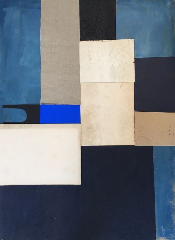
Contrast with colour.
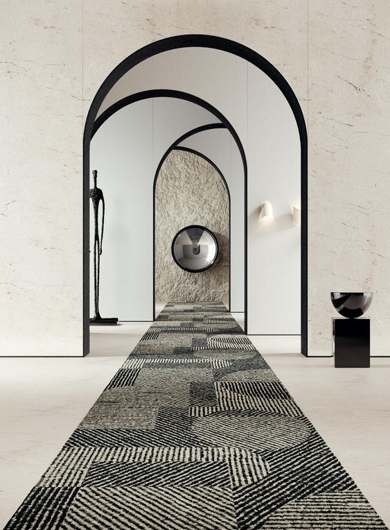
Contrast with curvature and depth.
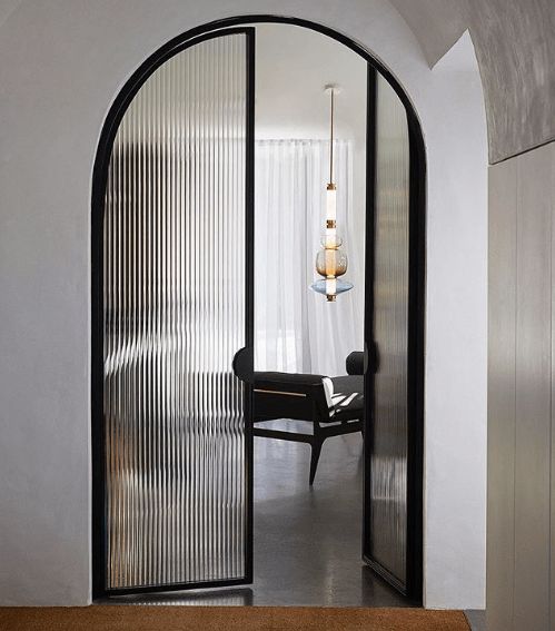
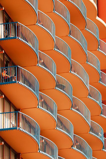
Contrast with lines, curvature and luminosity.
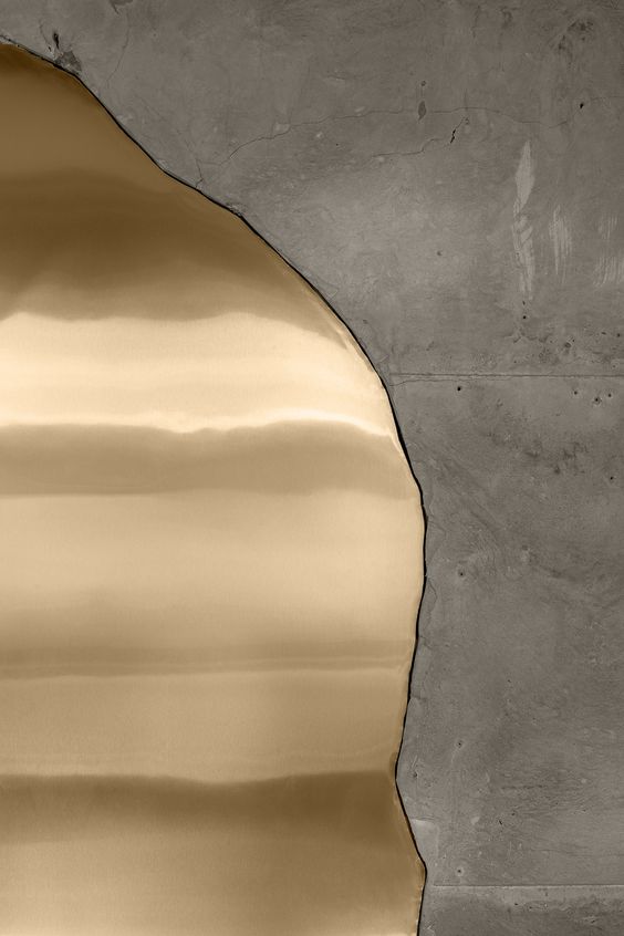
Contrast with different materials and texture.
As a fundamental principle of interior design, contrast is what draws the focus of your eyes while keeping the space coherent and relatable.
It is this dynamic punch that compels us to further immerse ourselves into that space in full appreciation of the experience and intimate awareness.
 |
 |
 |
 |
 |
|